Due to confidentiality, this write-up excludes details of in-depth findings.
Summary
Context
As a junior UX researcher at Samsung during the summer of 2017, I worked with the senior UX researcher to uncover insights around several of Samsung’s products. One of the larger projects I worked on was on mobile device search: Finder, on the Galaxy S8, which this write-up details.

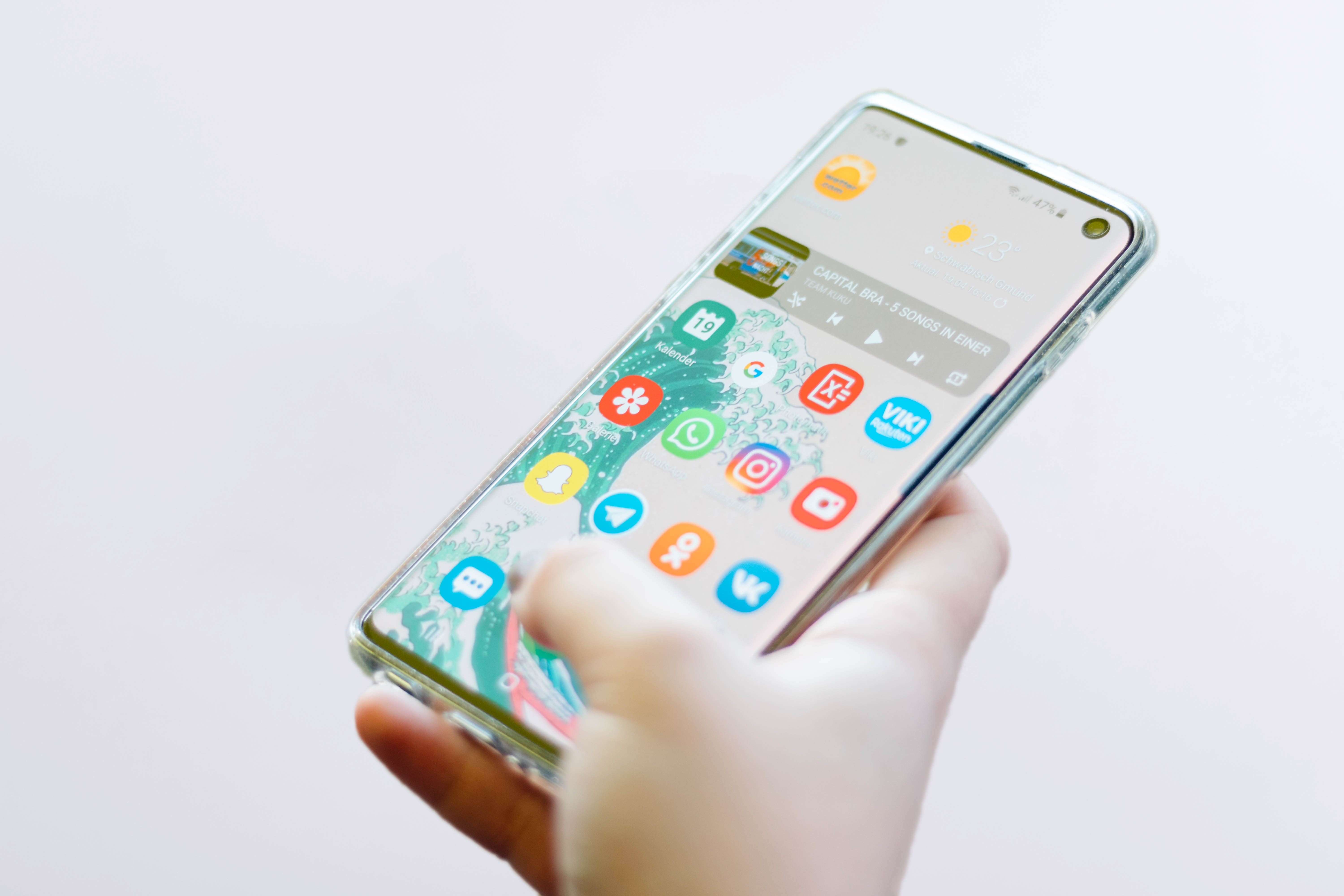
Figure 1. Galaxy S8+ mobile device search: app tray and results screens
Challenge
The mobile home design team sought opportunity areas to improve and re-envision device-search on the Samsung Galaxy S series. Greater focus was given to evolutionary opportunities with some early insights into further revolutionary explorations.
Outcome
After synthesizing raw data from research findings, journey maps of 4 use cases were constructed to map key search scenarios and communicate areas for improvement. These provided leaner, succinct documentation to inform the design of device search for future flagships.
Approach
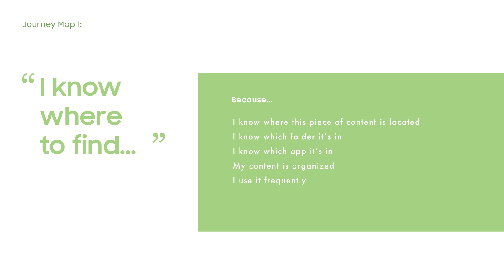
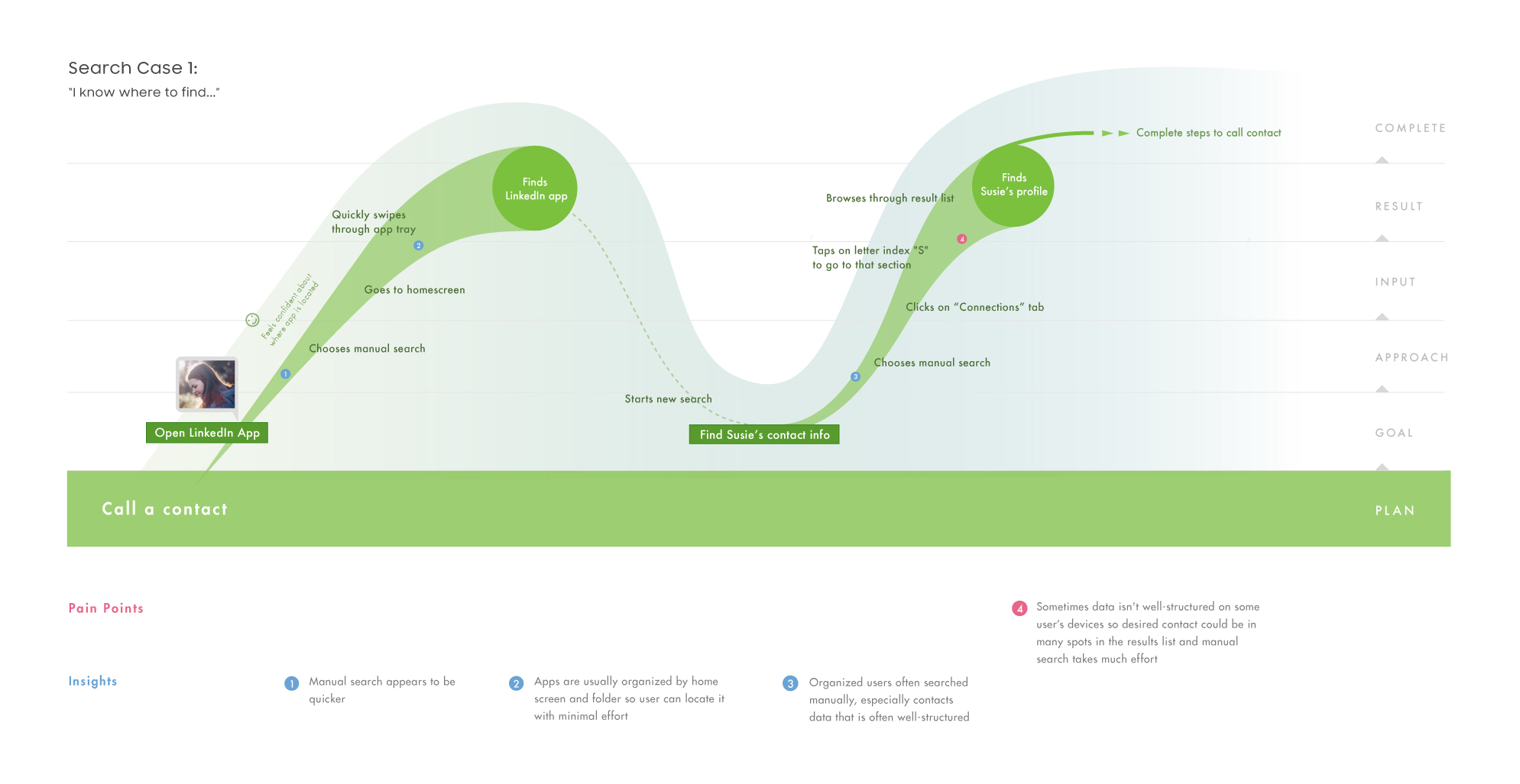
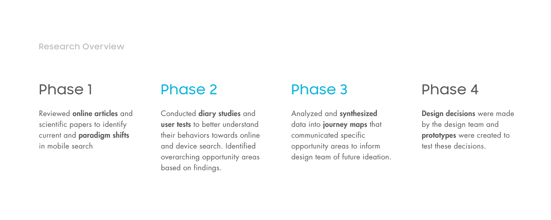
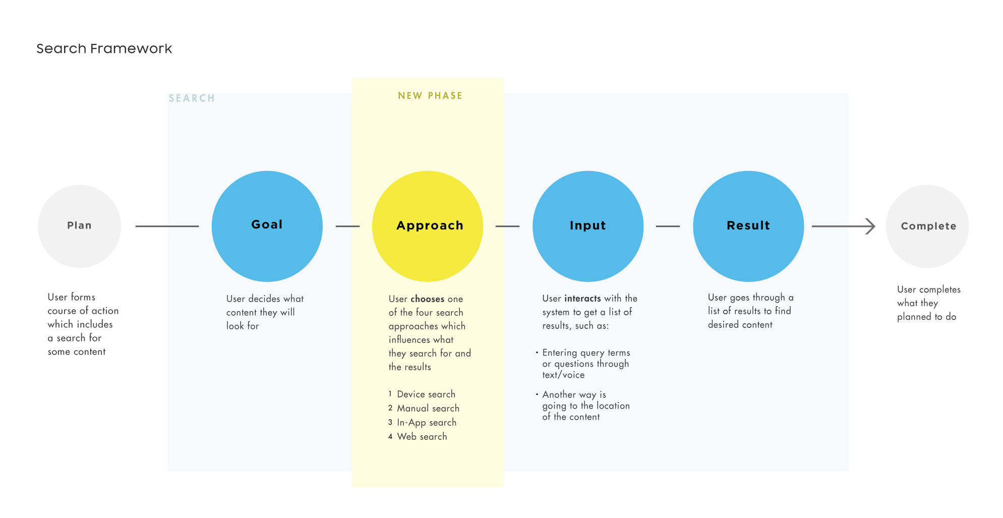
HCI frameworks were used to understand search behaviors from goals to actions as the area of investigation involved micro-interactions. Two main research methods were conducted: diary study and user testing, to help answer overarching research questions. Breakdown Research Phases I joined the UX team when phase 1 was near complete and was fully immersed in phases 2 and 3 (Figure 3). Phase 1 informed a few interview questions for phase 3 regarding people’s preferences towards search paradigm shifting opportunities. In phase 2, a total of 14 participants were interviewed (6 on the one day diary study and 8 on user testing which consisted of task analysis and concept testing). Before my term completed, phase 4 had just started and design decisions based from phase 3 were being prototyped for testing. Some Research Questions How often do people use device search? How are people using device search? What opportunity areas exist for mobile device search compared to online web search? What are the behaviors that differentiate the above two? The above research questions guided both the diary study and user testing. The purpose of the diary study was to get a feel for what people were mostly searching for, like a location or a person. Google’s Micro-moments and AOL/Insights high level search needs were used to organize findings, such as searches that stemmed from curiosity or searches to act on something. This information later helped inform the journey maps scenarios. The purpose of the user testing was to uncover how participants were specifically searching within their devices, and the methods in which they did so. We utilized 4 different smartphones to generalize the results: S8, iPhone 7, Pixel 1 and participants’ personal phones. Addition to search framework We found that there were four main approaches that participants used to search: Device search, manual search, in-app search and web search, and that these were dependent on the content they expected to find through these methods (Figure 4). The following figure shows a search framework that we used and the addition of the new search phase ‘Approach’ which was added after testing. The phases cycle back and forth depending on the context and are not confined to a linear flow. Some General Findings After analyzing data into coherent patterns and categories, data were grouped into 4 device search use cases that were shown in the form of journey maps depicting what were found to be common tasks: “I know where to find” (Figure 5 and 6) “I don’t know where to find” “I don’t know which one” “I like to kill time” Due to confidentiality, only the first journey map showing an ideal search case is shown here, and was used as a baseline among other scenarios with greater opportunity areas. Fig 5. Common reasons for an ideal search scenario Figure 6. Journey map of an ideal search scenario used as a baseline for use cases with greater opportunity areas Reflection Coming on to the UX team, I was excited to apply research methods I learned in an academic setting to a corporate one, and what I found was the main difference between user studies and experimental design. Having learned that acquiring a large number of participants determines the success of an experiment, it is not so in user testing and that 5 participants is enough to uncover patterns of friction. Once that friction is relieved, a new design can be tested with 5 more participants and so on. As this was the first time I created journey maps, I learned how to choose which information to include to succinctly communicate important findings and opportunity areas. I found that handling a lot of information made this more challenging, but that keeping the research goals in focus helped sift out weaker data.
