Scope
Visual + Web Design, Responsive Web Development
Tools
Illustrator, Photoshop, HTML, CSS3 1, Brackets Editor, HTML5 Boilerplate
Background
Since 2002, the project managers of Exhibau have designed and managed logistics of construction sites, from Nike venues to structures for the Olympic Games and traveling conference theatres for TED (Figure 1). Because Exhibau has established connections with existing clients, an online presence via a simple portfolio website was all they needed to present their previous works to potential clients. The following account details the process that went into designing Exhibau’s home page.
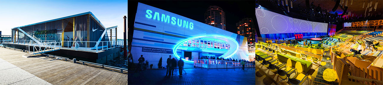
Figure 1. Select samples of Exhibau’s construction projects (from left to right): Nike Floating Pavilion, Samsung Olympic Pavilion, TED Traveling Conference Theatre 2.
Target Audience
With the following constraints in mind (Figure 2), the goal was to design a website with minimal animations and moving parts to ensure maximum usability for the primary stakeholders. At the same time, a modern visual design would satisfy the expectations of the secondary stakeholders.

Figure 2. Primary and secondary stakeholders draw constraints for design directions
Design Expectations
I involved my client in the design process by understanding their expectations and discussing website aspects they liked or disliked as a starting basis. It was interesting to see the following patterns emerge (Figure 3) with some points confirming certain usability standards (eg. simple non-cluttered design) while other points opposing specific web trends (eg. drop down menus).
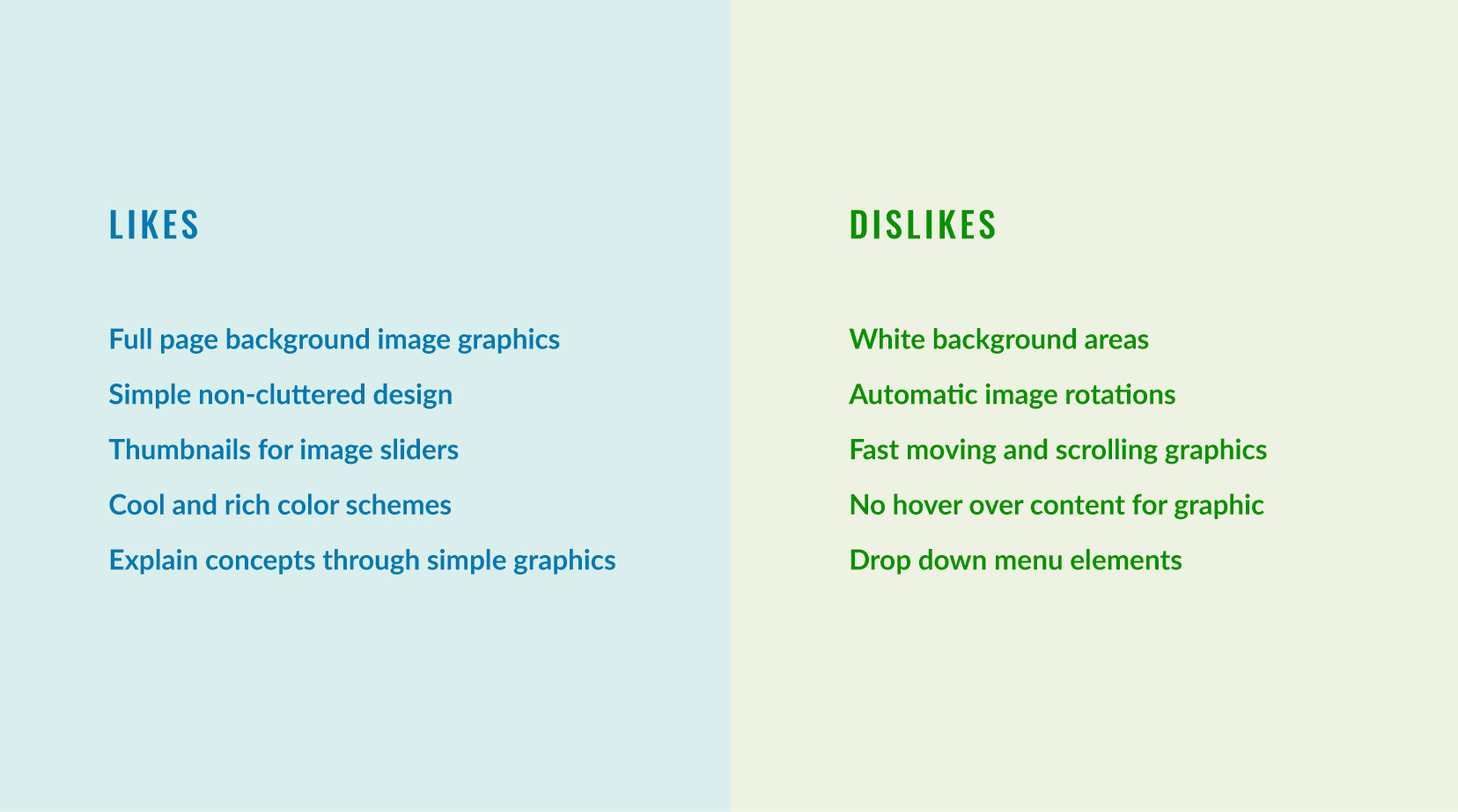
Figure 3. Likes and dislikes of website design examples
Color Scheme
Exhibau had an existing logo, but they did not have an established brand color, so I put together a list of personality traits that best described the company based on their working style and types of construction sites they have built. Some key traits included modern, professional, agile, smooth and strong. The following complementary color scheme (Figure 5) represents this persona where the blue monotones are dominant colors and the yellow is the subordinate color.
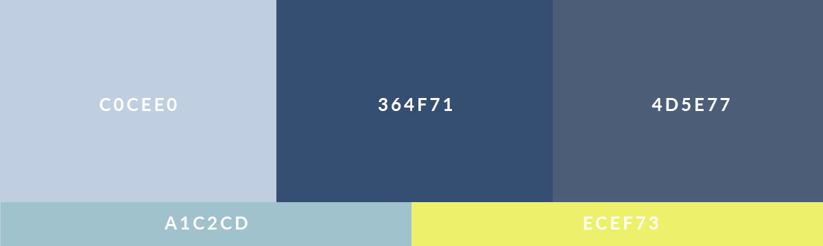
Figure 4. RGB Color Scheme for Exhibau website personality breakdown: The low chroma sky blue (top left) is calm, whereas the royal blue (top center) appears strong and stable; the toned-down royal blue (top right) brings ease to the eye by bridging the contrast between the light and dark blues. Hints of yellow adds a sense of liveliness which act as accents that draw the eyes in, and a lighter Blue/Green tint allows for a smoother transition between all the colors while providing additional contrast.
Background Pattern
I created the following pattern to frame the introduction header section in order to add dynamic and a subtle sense of energy upon arrival to the landing page. The colorful triangular pattern (Figure 5) adds this splash of energy that supports the modern appeal (left), and its subdued version through a creamy sky blue filter (right) wraps all the vivid triangle colors inside the main color scheme.

Figure 5. Triangular background pattern for the introduction header section of website: True colors (left) and filtered colors (right)
Font Combination
Reasons for choosing Oswald and Lato:
- Oswald, a narrow sans serif communicates a strong, agile and modern persona
- Lato, a wider and rounder sans serif, is easy to read on screen with a variety of styles for versatility, and also communicates a modern persona
- The narrow width of Oswald contrasts Lato’s wider width, and this contrast creates a more balanced and interesting composition
- Slight kerning on Lato subtitle text adds additional contrast against the tightly kerned Oswald, and provides space for the eyes to move in between the letters
- Uppercase Oswald is good for title text because the even heights increases readability with large sizes
- Both Oswald and Lato are web-safe, free and easy to use from Google Fonts
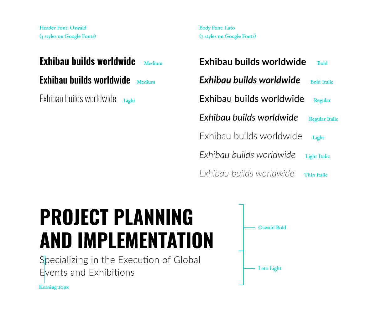
Figure 6. Font combination for Exhibau website: Oswald and Lato
Layout Exploration
Exhibau wanted a simple landing page that would ultimately display their strong credibility in the exhibition building industry. To do this, I explored ways to highlight Exhibau’s grand network scale and building projects around the world: from a timeline based concept to abstract dots with city names (Figure 7). The decision was to include a map with radiating dots and their city names because it communicated most clearly places they have built. I also explored ways to showcase recent projects as a means of transitioning smoothly from where they have built to what they have built.

Figure 7. Sketches of the concept of building worldwide and exploration of recent projects section.
Wireframes
The following image shows the concept wireframe (left) based on a conversational flow framework: from a quick introduction of what Exhibau does, to presenting one of their building projects, to showcasing companies they have worked with, and then ending with a call-to-action. The layout wireframe (right) indicates more specifics of text and image positioning. Since the website would provide a means for potential clients to contact Exhibau, it was decided that a contact form at the end of the page was needed to satisfy the call-to-action.
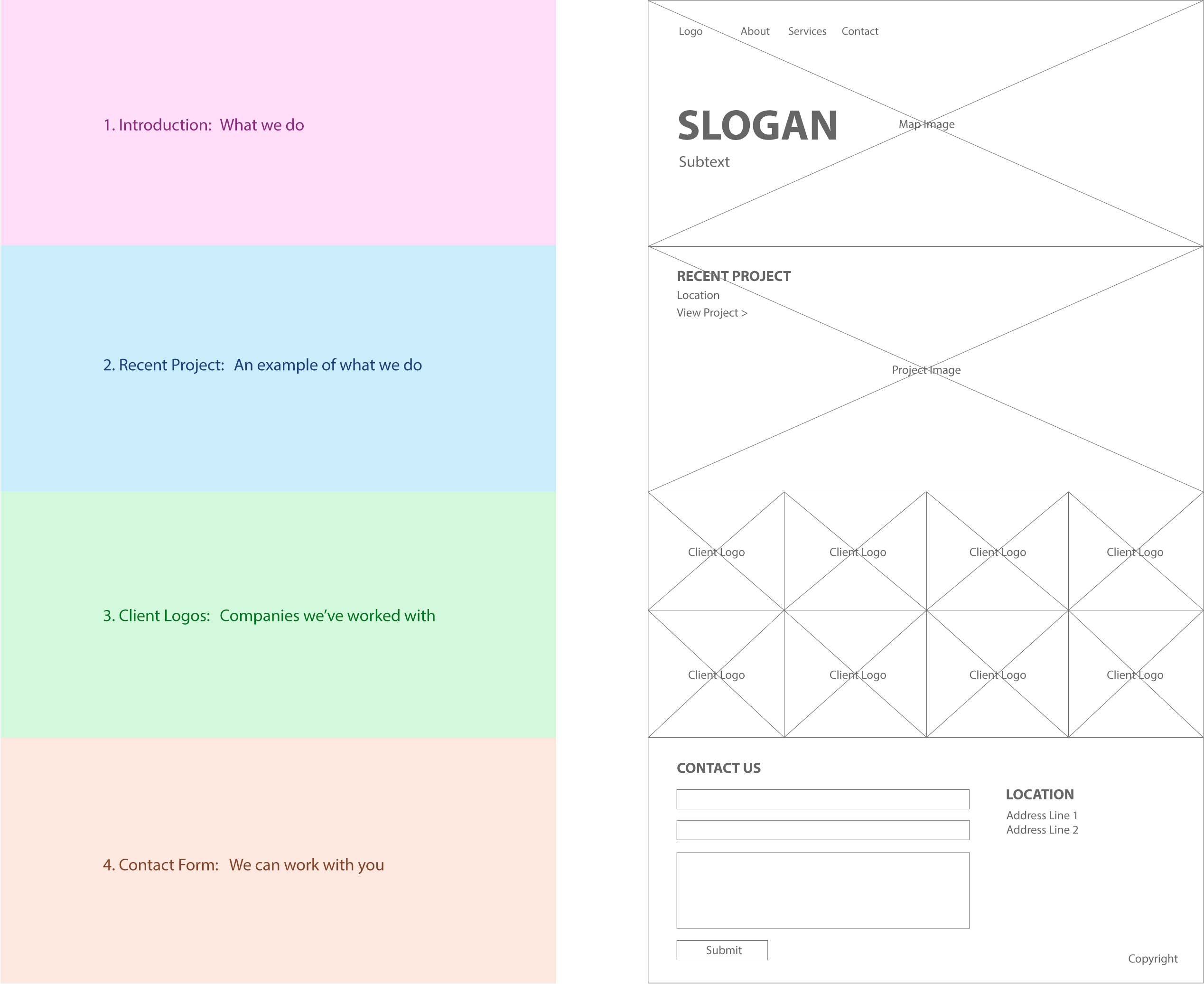
Figure 8. Concept wireframe (left) and Layout wireframe (right)
Responsiveness: Column Gutters
Page and column gutters were reduced on mobile (Figure 9), and font sizes were decreased to better fit smaller screen and increase readability. The large map with city location dots on the introduction area were removed to accommodate mobile load speed. And certain rows with more than one column stacked on top of one another (eg. contact form and office location addresses). Mobile breakpoints were based on content best fit.

Figure 9. Desktop (left) and mobile (right) wireframes with gutter spacing in pixels
From Mockup to Code
The client logo area was reduced because it appeared larger than anticipated and was not meant to be the center focus, so instead of two rows, one row was implemented with a slow fade-in effect to show the next set of logos (Figure 10). Designing the client logo area was more of a challenge than I had thought because of their uneven dimensions and colors. I resolved to framing each logo in rectangular boxes and made them all the same color against the main color scheme that increased balance and harmony.
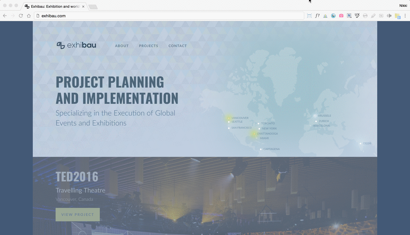
Figure 10. Gif of Exhibau coded home page on desktop browser
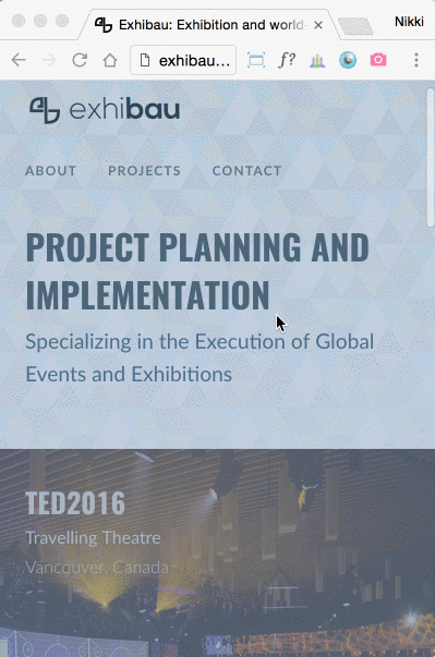
Figure 11. Gif of Exhibau coded home page on mobile (400px x 600px)
Reflection
I realized that there were certain design element specs that I decided during the coding process which could have been decided earlier on to make the transition between mockup to code smoother. For instance, I could better plan text hierarchy with consideration to HTML header tags and required text styles to ensure a consistency across page sections. Because of the dynamic nature of responsive websites, I learned that careful planning of spacing, sizing and content variations are highly beneficial. So all in all, I would like to be more precise in strategizing font size and styles, as well as content choice and presentation pertaining to responsive layouts.
References
Urrutia, K. (n.d.). Creating a CSS3 Pulsating Circle. Retrieved 2015, from https://codepen.io/danest/pen/GxfqB/. Exhibau’s pulsating circles were adapted from Urrutia’s original CSS3 code 1.
Wallain, P. (n.d.). [Exhibau Select Project Images]. Retrieved 2015. The project images belong to Exhibau and their building partners which I edited and adapted for the purpose of detailing the design process 2.
World Map Vector Outline. (n.d.). Retrieved 2015, from http://www.animationoptions.com/photobphi/world-map-vector-outline. The map on Exhibau’s home page was adapted from the map taken from World Map Vector Outline.