
Role
Interaction, User Interface, Usability Testing, Website Layout Development
Team
Joy Kong (Visual Design), Pouria Assadipour (JS Development)
Tools
Illustrator, Photoshop, HTML, CSS3
Overview
Context
Every year, TEDxSFU hosts a conference for the SFU community where a diverse group of speakers share stories and insights from their areas of expertise (Figure 1). I was part of the Creative Team on the 2016 Organizing Committee where I led the designing of the first conference program guide mobile site. The following write-up details the process of two main components: 1. Navigation interaction and 2. Visual layout.
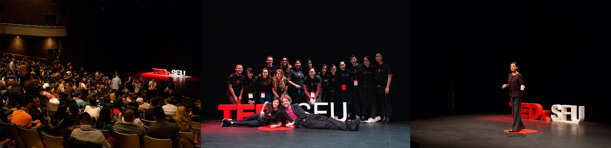
Figure 1. Select images from the conference1 (from left to right): Audience seated inside the theatre before commencement, Organizing Committee team photo, Speaker Missy Jena sharing her talk on transforming education.
Problem and Constraints
As a non-profit, the team considered ways to save expenses, and found that if we moved from printed program guides to digital versions, we could save over $2000 on printing (Figure 2). As well, observations from previous conferences were that a large amount of printed program guides were thrown out by the end of the event. Thus, we saw creating an online version as an opportunity for change.

Figure 2. Cost-benefit overview of mobile site program guide design that contributed to defining design constraints
1. Navigation Interaction
Exploration
The goal was to devise a seamless navigation experience since the mobile platform depends much on interactivity. Required sections included information of the schedule, speakers, lunch, theatre etiquette, about TED/TEDx and sponsors. I wanted to think beyond responsive web trends and explore other ways of achieving a more seamless navigation experience, so I diverted to designs that were used more on mobile apps, such as sticky footers (Figure 3. bottom left corner) and a multiple list view row layout (center left).
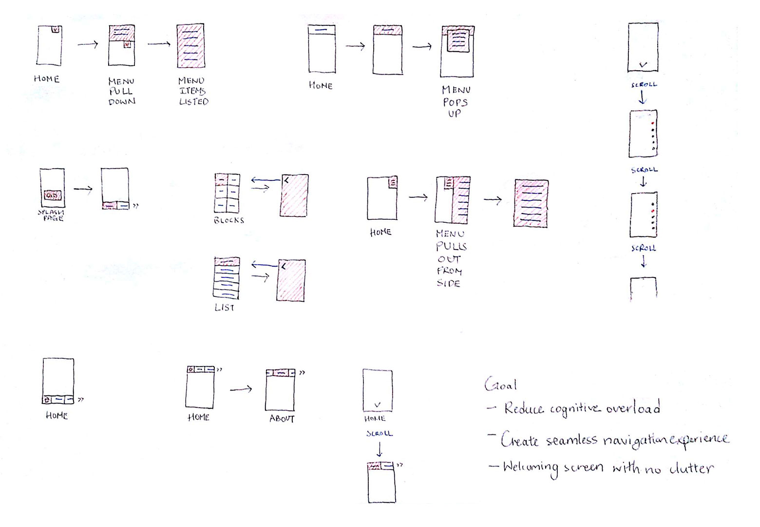
Figure 3. Sketches of menu navigation interaction possibilities.
Testing ideas through low-fidelity prototypes
I built paper prototypes of two navigational experiences to get a feel for their ease of use (Figure 4). The following image shows the top row of a full page drop-down menu that pushes the main content down from the top of the screen, and the bottom row represents an overflowing x-axis header that can be dragged left and right. The idea was that both navigation stuck to the top of the browser window and provided distinct behaviors when interacted on.
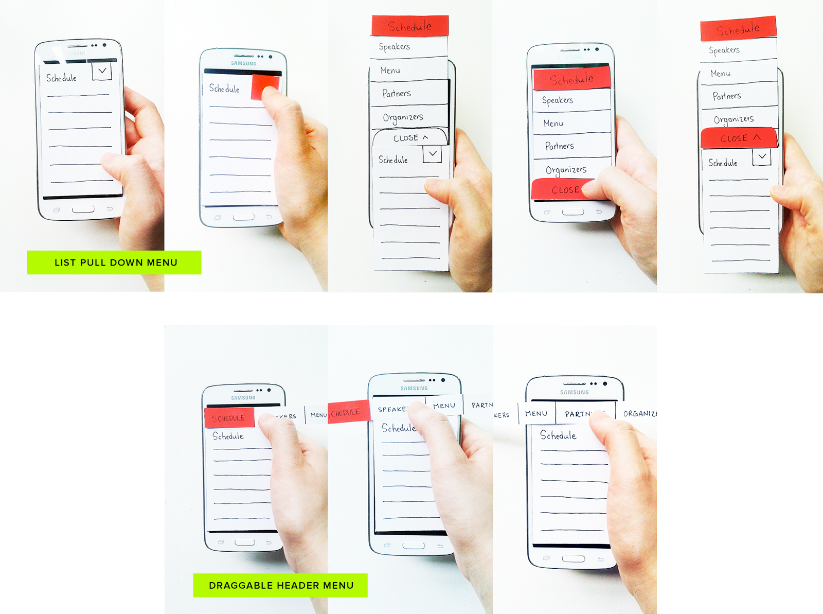
Figure 4. Exploring two directions of the menu navigation through paper prototyping: Full width drop down menu (top row) and draggable left and right menu (bottom row).
Research Hypothesis Formation
What I learned from the paper prototypes was that the drop-down menu took additional steps when making a selection and this felt more fitful than when using the draggable header menu. I questioned the validity of my observation by forming and testing the following hypothesis: The draggable menu produces less cognitive load than the list menu when users choose to navigate.
I operationally defined cognitive load as the amount of time it took to complete a task and the number of obstructions to usability:
- General click and navigational rate
- Hesitation and mistakes
- Subjective rating of navigation ease of use measured by a 5-point likert scale
Research Materials and Procedures
To measure cognitive load on UI interaction, medium fidelity prototypes were created (Figure 5). The following image shows two design directions that were tested. I decided to modify the full page drop-down menu to a quarter page pop-up menu because it was more feasible, yet the design still kept to the same concept of a list display. This list design opposed the left-and-right layout of the draggable header menu, which was key to testing.

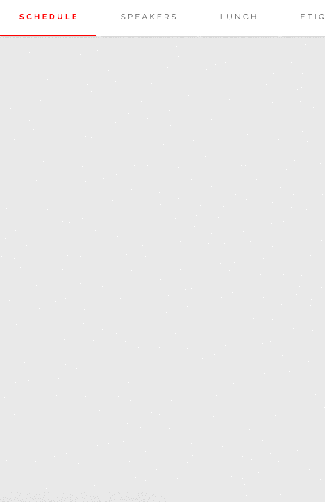
Figure 5. High fidelity prototypes of the menu navigation with two interaction design directions: List menu (left) and draggable menu (right).
To prevent order bias, an in-between groups design was implemented where one group tested the pop-up menu while the other group tested the draggable header menu. To prevent conflict of thought processes, each participant tested the menu individually. It should be noted that the usability testing included page content in order to make navigation meaningful, but for the sake of discussing the navigation usability results, I am merely showing the menu design here.
Each participant were encouraged to engage in concurrent think aloud as we observed their behaviors and engaged in concurrent and retrospective probing2. These methods helped us better understand each participant’s concerns and expectations in order to make informed design decisions. A 5-point likert scale measured navigational experience where the number one represented a confusing/horrible experience and the number five represented an intuitive/pleasant experience.
Research Results: Likert Scale and Usability Barriers
According to the likert scale results, the draggable menu was preferred over the pop-up menu (Figure 6). Two scores out of twelve were not included because they were exposed to both navigation designs. The pop-up menu’s error bar is greater because some participants gave their evaluations without considering their unawareness of a clickable menu. Preliminary testing would help to sift out this factor and provide a more reliable result.
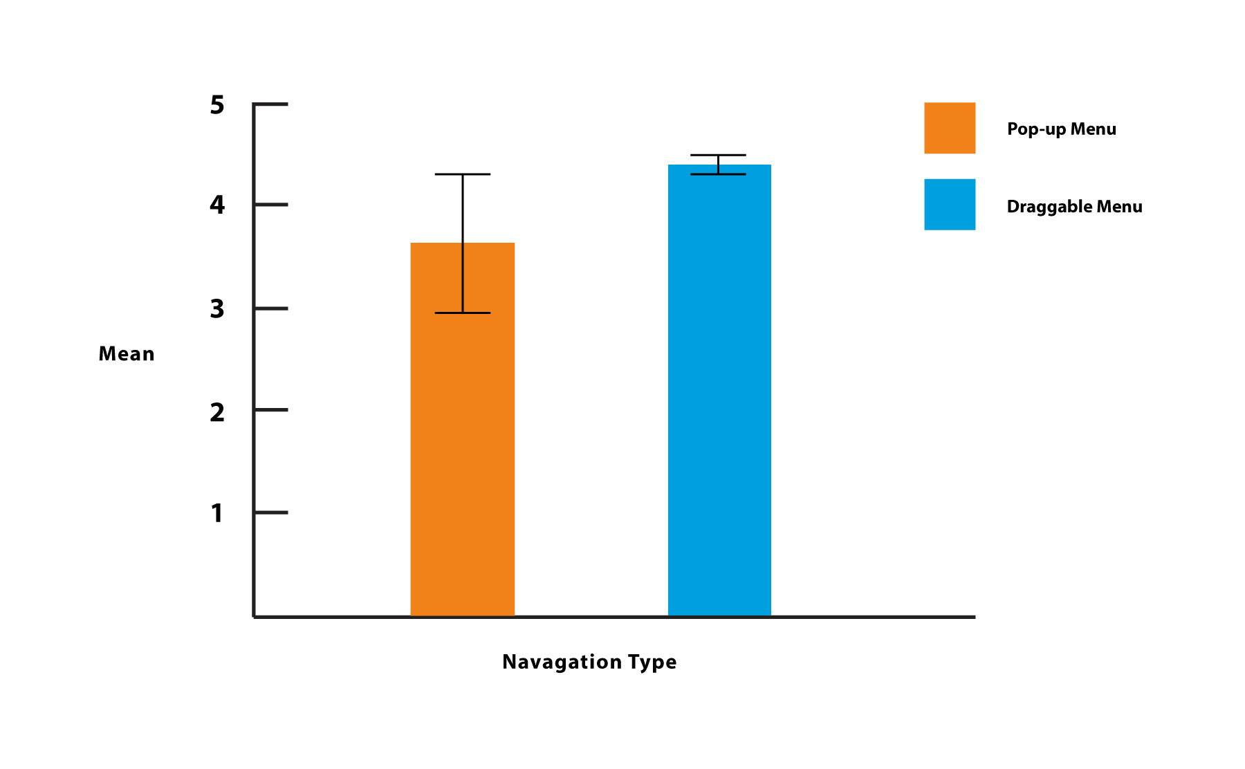
Figure 6. Likert scale results with error bars showing the mean score from the navigation experience of a 5-point rating.
Suggestions held that having the arrow closer to the link text and revealed on page load would communicate a more obvious affordance (Figure 7).
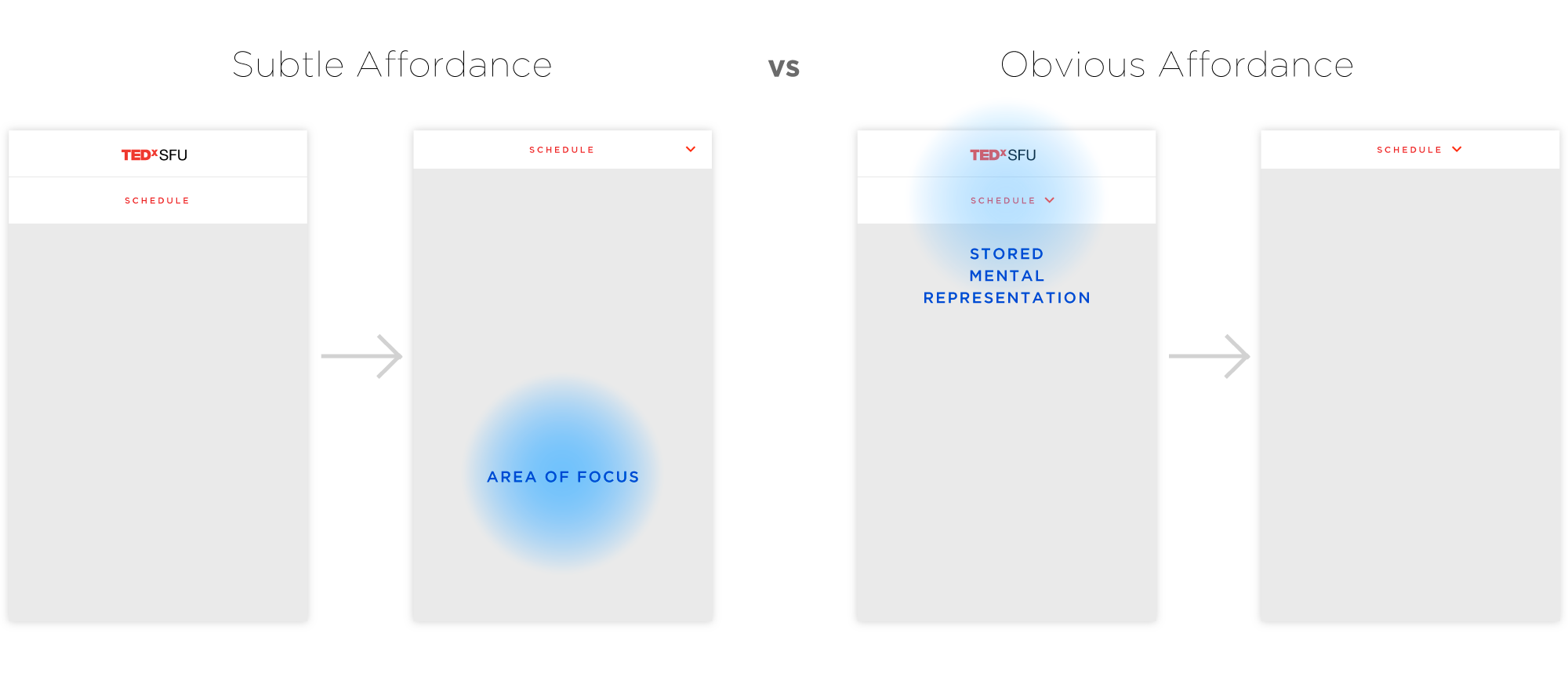
Figure 7. Menu list navigation design: Subtle affordance with down arrow appearing as the header hits the top screen (left) versus an obvious affordance with the down arrow in place on page load (right)
A common pattern that occurred for the draggable header menu was that an affordance for dragging did not appear on smaller screen devices like the iOS 5 because the menu text appeared evenly spaced within the width of the screen (Figure 8). As a result, some participants did not drag the menu. One solution to this issue was to decrease the percentage padding in between the text to allow menu content to adjust automatically to smaller screen sizes such that the last text on screen would appear slightly offscreen. An additional solution was to increase spacing on the first menu item to create an unbalanced positioning that affords dragging left.
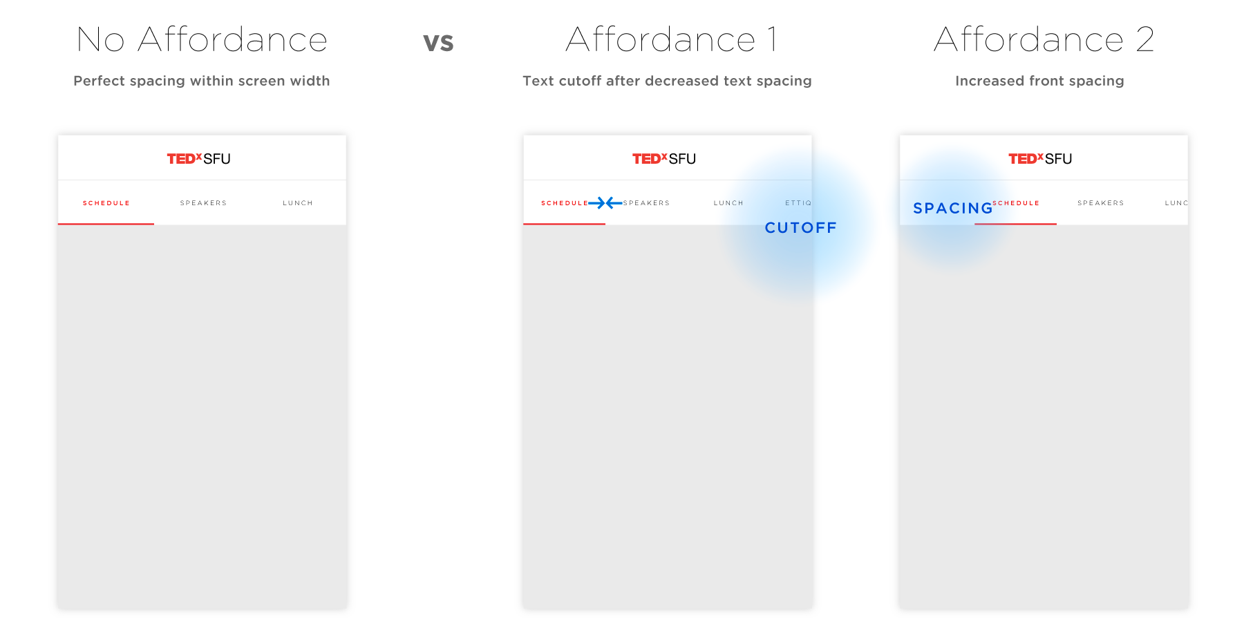
Figure 8. Creating affordances for dragging the header menu for smaller devices like the iOS 5.
The effect of mental models
It may be the case that the likert scale correlates with cognitive load such that greater ratings equates to less cognitive load. Other factors, such as a participant’s mental model of mobile website navigation, may also be confounds. For instance, one participant intuitively dragged on the menu header to view more items because of past experience with similar functions on their regularly visited sites. In another case, a participant using an iOS had an aggressive swiping style that activated the back/forward browser functionality when quickly dragging on the menu. Thus, exposures to different navigation styles may have induced certain expectations of the design based on past experiences, which could have influenced the result of the test.
Research results: Click time
Exact time was not counted, but it was observed that the click rate of the draggable design was faster than the click rate for the pop-up menu design. My reasoning for this observation is illustrated in the following image (Figure 9), where the draggable menu represents a synchronous interaction model between user and system. As a result, the user’s selection process is influenced by the system and the appearance of a next item provides greater affordance to click. On the other hand, the alternating interaction model relies on a back and forth conversation as the user waits for the system to respond. This relationship may have contributed to the selection delay, as well as the slower nature of scanning through a list.
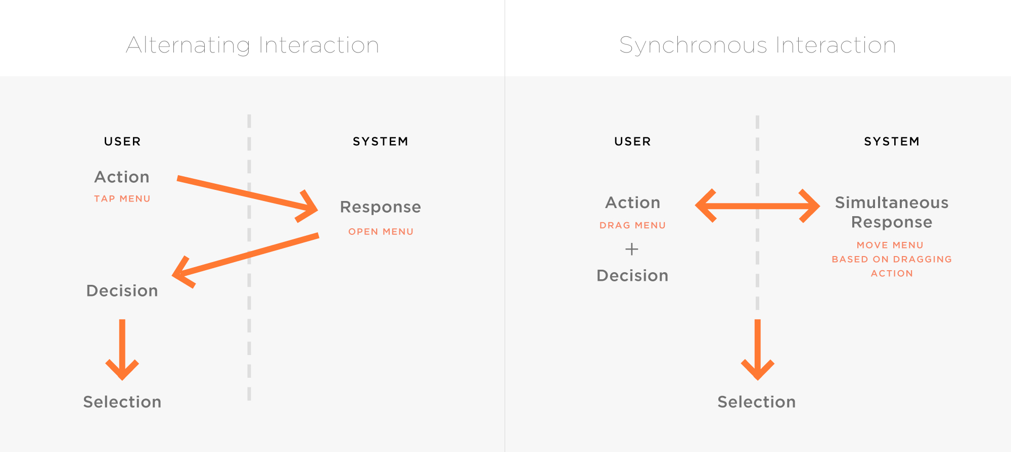
Figure 9. HCI concept of the two menu navigation directions: list menu utilizes an alternating interaction (left) and the draggable header menu utilizes a more synchronous interaction (right).
Direction Choice: Minding the Specifics
Overall, there is evidence that supports the hypothesis, though more testing need be completed to eliminate potentially confounding variables. Because of this, the draggable menu design was pursued since it produced limited confusion, and a decision needed to be made due to time constraints. The following diagram illustrates specifications for JavaScript development with consideration to Android and iOS (Figure 10). iOS devices, for instance, have a built-in content bounce back function, whereas Android devices do not. Because of this, a gradient color was used to highlight that an end was reached.
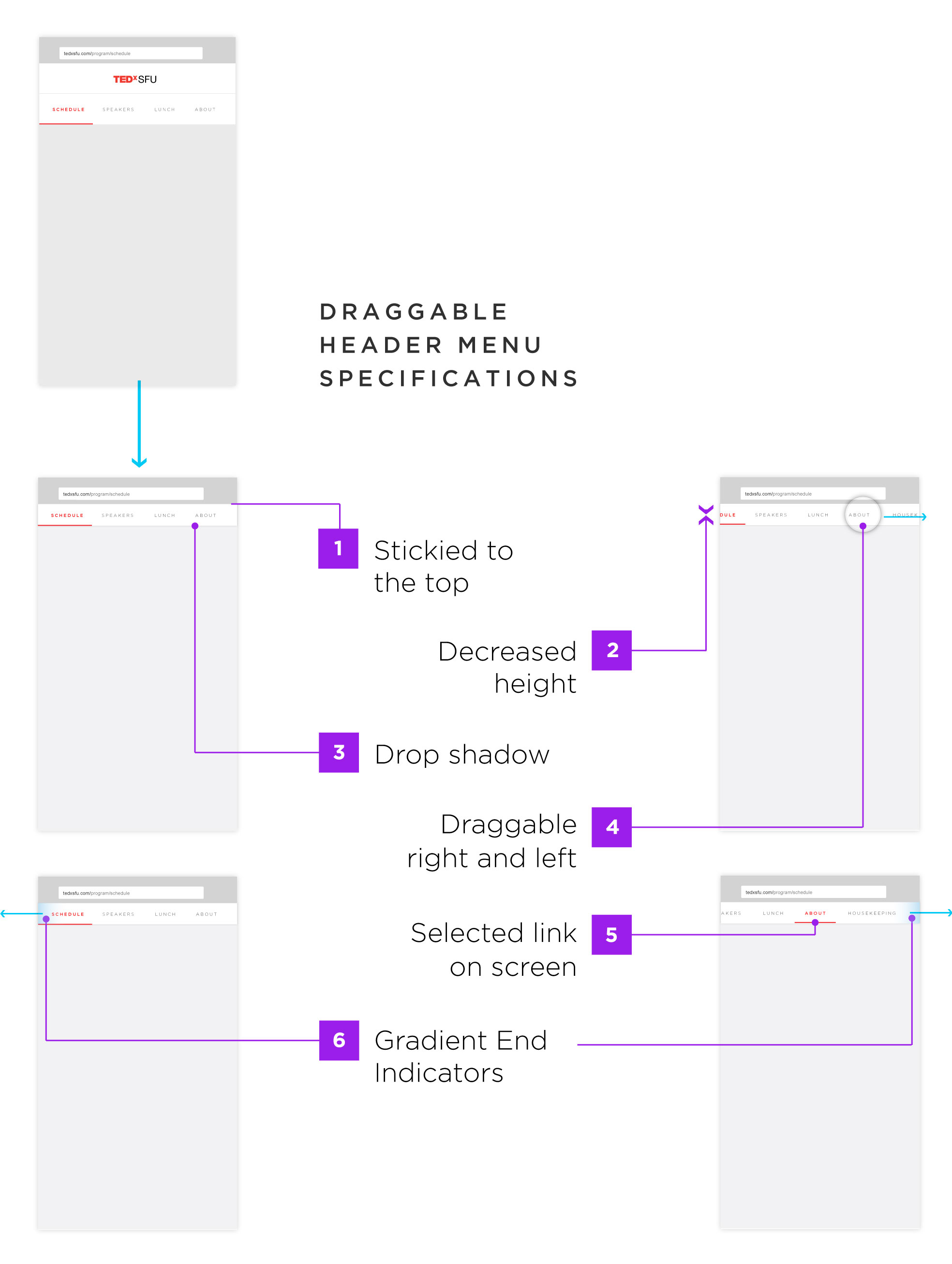
Figure 10. Draggable header menu design specifications to increase the intuitive motion with particular attention to an Android solution to indicate end of navigation due its lack of response.
2. Visual Layout
Extending the TED Brand
It was important that our design represented the TED brand as closely as possible, so I drew on TED’s 2016 program for their structure and content. TED’s program guide, however, was viewable only on desktop, so I had to strategize content placement and layout structures suitable for mobile phones. I explored ways to display speaker bios and interactions that would make it easier to search for a speaker. The schedule and speaker pages provided the main framework for other pages, so I sketched some layout ideas for these two sections (Figure 11).
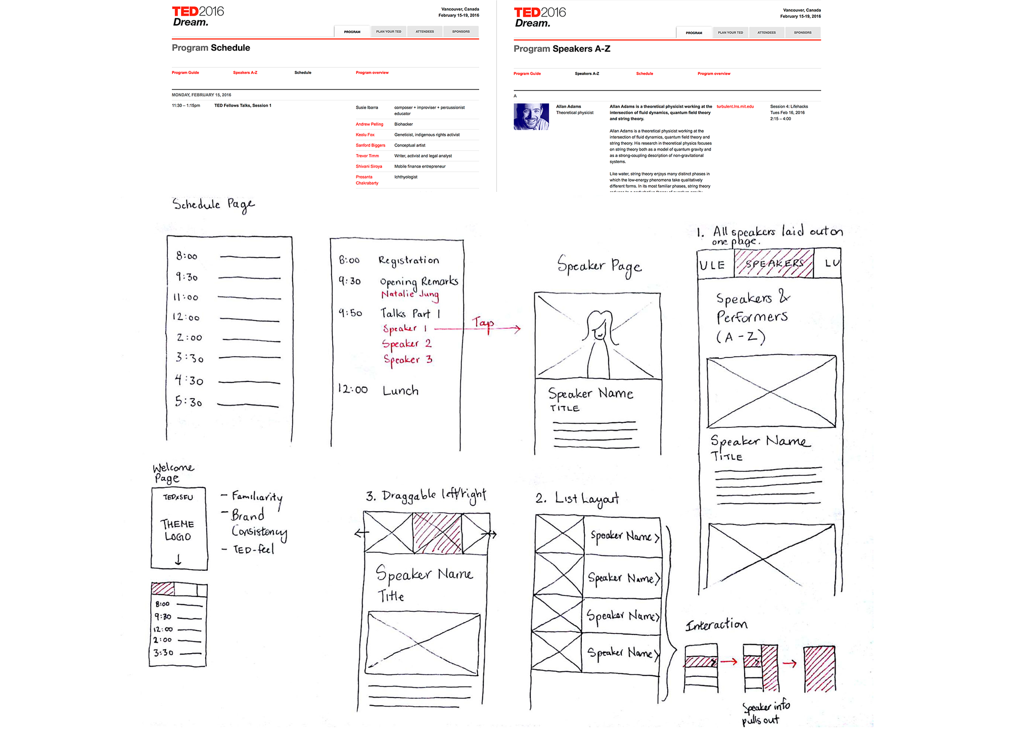
Figure 11. Sketches of the layout for schedule and speakers pages.
Grids
The columns were based on a fluid grid that used percentage values with flexibility for viewports from small phones up to tablets. This slight flexibility allowed for enhanced experience on slightly varying mobile dimensions (Figure 12). Designing for desktop was not a priority since the main devices used during the conference were mobile. Nevertheless, up to a certain width, like larger dimensions on desktop browsers, the navigation menu spacing stops increasing and remains fixed.

Figure 12. Fluid grid system to accommodate slightly varying sizes of mobile devices from small phones to tablets.
Font Combination
I chose Raleway as the title text because it was similar to our theme logo which used the Gotham typeface. Gotham is not web-safe, however, so I resorted to options from Google Fonts, and chose Raleway because it provided numerous styles which allowed greater flexibility. Although narrower than Gotham, Raleway can appear more geometrically squared when provided with appropriate kerning (Figure 13). Lato was also available on Google Fonts and complemented Raleway as a body text while adding to the modern feel of the overall design.

Figure 13. Font selection and combination: Raleway as the title text and Lato as the body text, and red indicating links.
From Mockups to Testing and Iterations
General feedback from usability testing for the schedule page was that the information was laid out in a simple and easy to understand manner, which participants felt pleased with. Iterations included boldening of thin fonts to increase readability and affordance for link clicking. As well, information about activity details were added, such as available refreshments and a link to the lunch menu.
For the speakers page, the thumbnail images of speakers were made draggable left and right much like the navigation header menu. I decided that utilizing the same interaction would help to reduce a user’s cognitive load because they had learned the dragging behavior from the header menu (Figure 15). After testing, this proved to be the case as participants naturally browsed through the speaker images. To increase intuitiveness, I added additional spacing to afford dragging and a box shadow to each image to afford clicking.
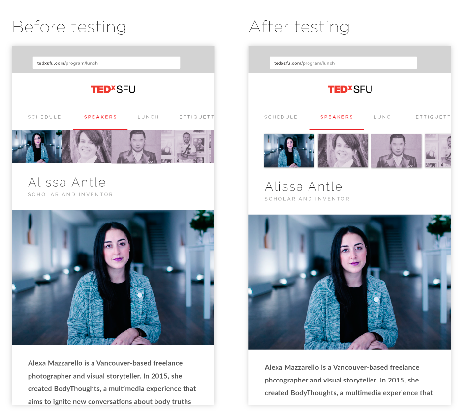
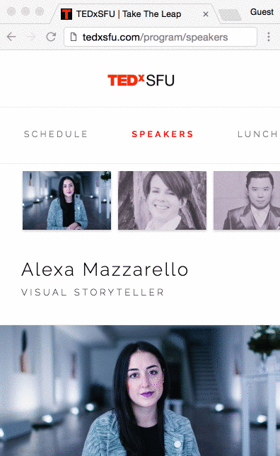
Figure 15. (From left to right) Mockup of speaker page before testing (left), design of speaker page after testing (center), and a screen recording of the speaker page on a web browser (right).
The following figure shows a mockup of the lunch page design before testing alongside an iterated version after testing (Figure 16). I found that most participants were confused about whether they could select the menu online. When I asked why they thought this was the case, one participant mentioned the wording confused them and another mentioned the “Or” graphic gave them the impression they could select a menu option right away. With this feedback, I decided to create an intro section with illustration to make instructions clearer.
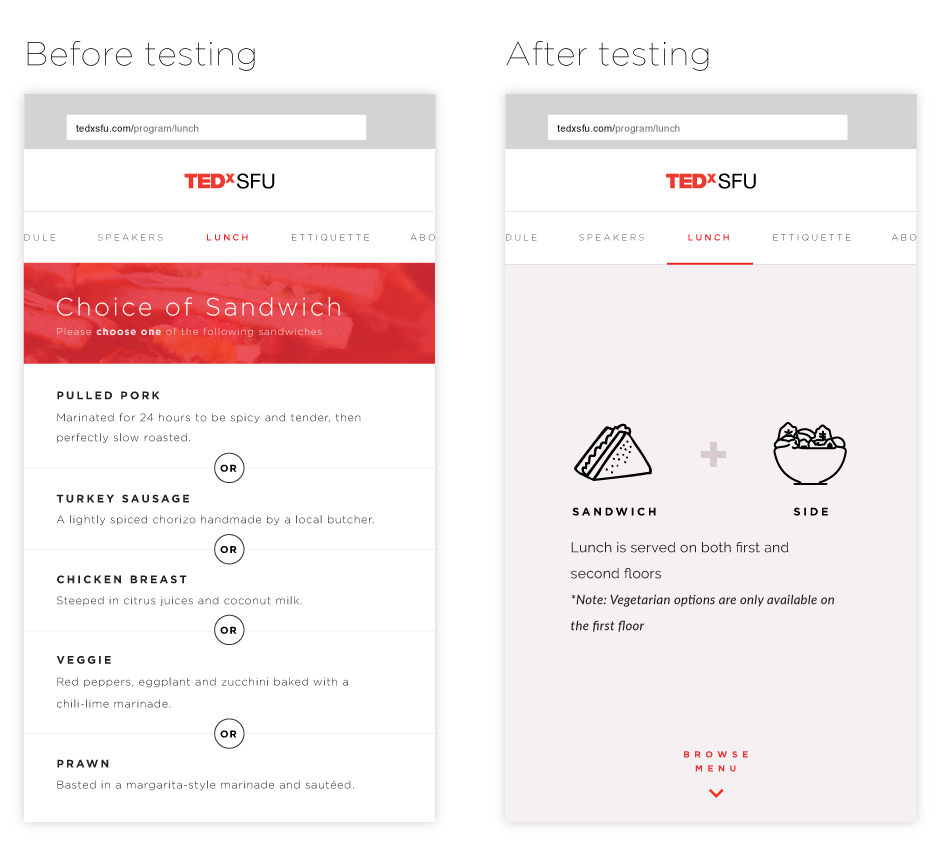
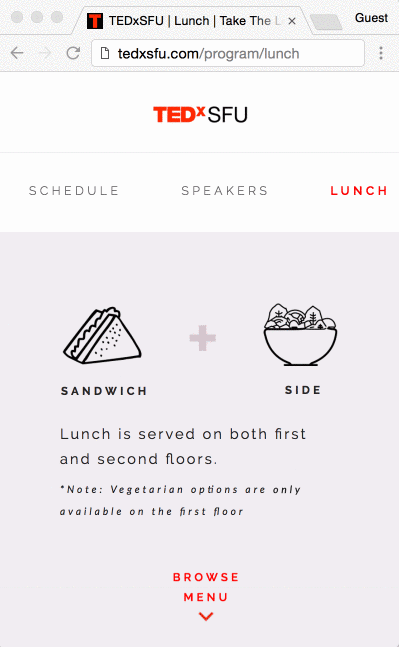
Figure 16. (From left to right) Mockup of lunch page before testing (left), design after testing3 (center), and a screen recording of the lunch page on a web browser.
Overall, the lunch page existed to inform attendees of the options available, as well as food allergies and sensitivities that they may want to know. This design added to the overall experience because lunch line-ups were long and attendees could conveniently check the menu on their personal phones as they waited in line (Figure 17).
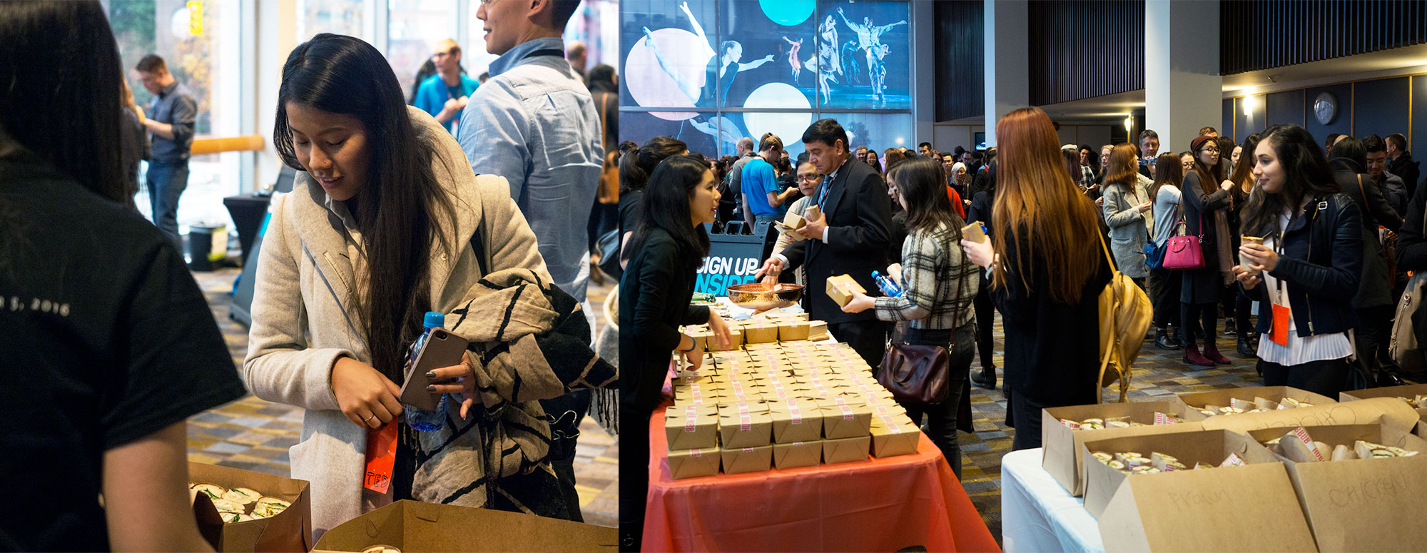
Figure 17. Lunch lines were long, which provided an opportunity for attendees to check available options and food allergy information1.
Reflection
Moving forward, it would be beneficial to consider the experience around the mobile design, such as when a person first accesses the online program guide and when they re-access it. The team thought about this somewhat for the menu page because we assumed attendees would browse the menu while lining up for lunch. However, the on-boarding experience and other touch points, like break times, could have been better considered and implemented since we noticed the number of web sessions fell below number of attendees. Some possibilities for this might have been attributed to: a lack of device, wifi connection issues, disinterest in checking out the guide, dependence on a friend’s device and/or lack of knowledge of guide’s existence.
Working on this project increased my appreciation for prototyping and testing early. Doing so would allow for more confident and quicker decisions to be made.
As for work flow and technicalities, I want to develop a better system for creating rapid prototypes in order to test more often as I found coding prototypes to be slower. Perhaps utilizing prototyping tools that include motion can help to simulate quicker tangible interaction experiences.
References
Affairs, A. S. (n.d.). Running a Usability Test. Retrieved January 09, 2017, from https://www.usability.gov/how-to-and-tools/methods/running-usability-tests.htmlResearch methods utilizing the concepts of concurrent think aloud and retrospective probing were drawn from Usability.gov2.
Broccolidry. (n.d.). IcoMoon App – Icon Font, SVG, PDF & PNG Generator. Retrieved January 09, 2017, from https://icomoon.io/app/#/selectSVG fonts, such as the plus sign created by Broccolidry, on the lunch page was provided by Icomoon’s web app3.
Chow, B. (2017, January 09). TEDxSFU 2016 -bchow. Retrieved January 09, 2017, from https://www.flickr.com/photos/tedxsfu/albums/72157672661221384B.Chow is the photographer of the above TEDxSFU conference images which are posted on TEDxSFU’s Flickr account.1
Creepjank. (n.d.). Vector illustration of a Vegetable Salad in Bowl . Retrieved January 09, 2017, from http://www.istockphoto.com/nl/vector/vegetetable-salad-in-bowl-vector-icon-gm512343920-87122855?st=_p_salad bowlThe salad bowl icon on the lunch page was adapted from the illustration author Creepjank3.
Krug, S. (2010, February 10). Rocket Surgery Made Easy by Steve Krug: Usability Demo. Retrieved January 09, 2017, from https://www.youtube.com/watch?v=QckIzHC99Xc&t=1sOur usability testing technique was inspired by Krug’s observational and reflective listening method.2.
Stoika, M. (n.d.). Icon food vector. sandwich icon. Retrieved January 09, 2017, from https://www.dreamstime.com/stock-illustration-icon-food-vector-sandwich-icon-icons-image70882242.The sandwich icon on the lunch page was adapted from Stoika’s sandwich icon3.