![]()
Trails offers a quick look into a national park experience by providing an on-the-ground perspective that aids trip decision-making and meets destination web searches during the micro-moments of “I-want-to-know” to “I-want-to-go” . It is a component designed within Google Destinations that extends into Google Trips with the goal of enhancing the experience from home to the outdoors.

Meeting quick searches for curious travel seekers
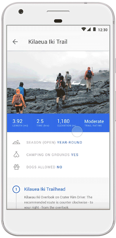
Trail info at first glance supports the “I want to know” micro-moment with quick relevant information related to a person’s goals, such as trail difficulty and a park’s unique feature to help gauge suitability.
Supporting the mental model of early destination inquiry
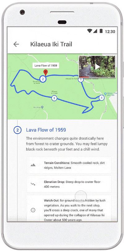
A trail line marks important stops along the path. The interaction toggle between media content and map provides people with the ability to zoom in and out matching their mental models of learning about a destination as they gather digestible and relevant information to get a feel for a park.
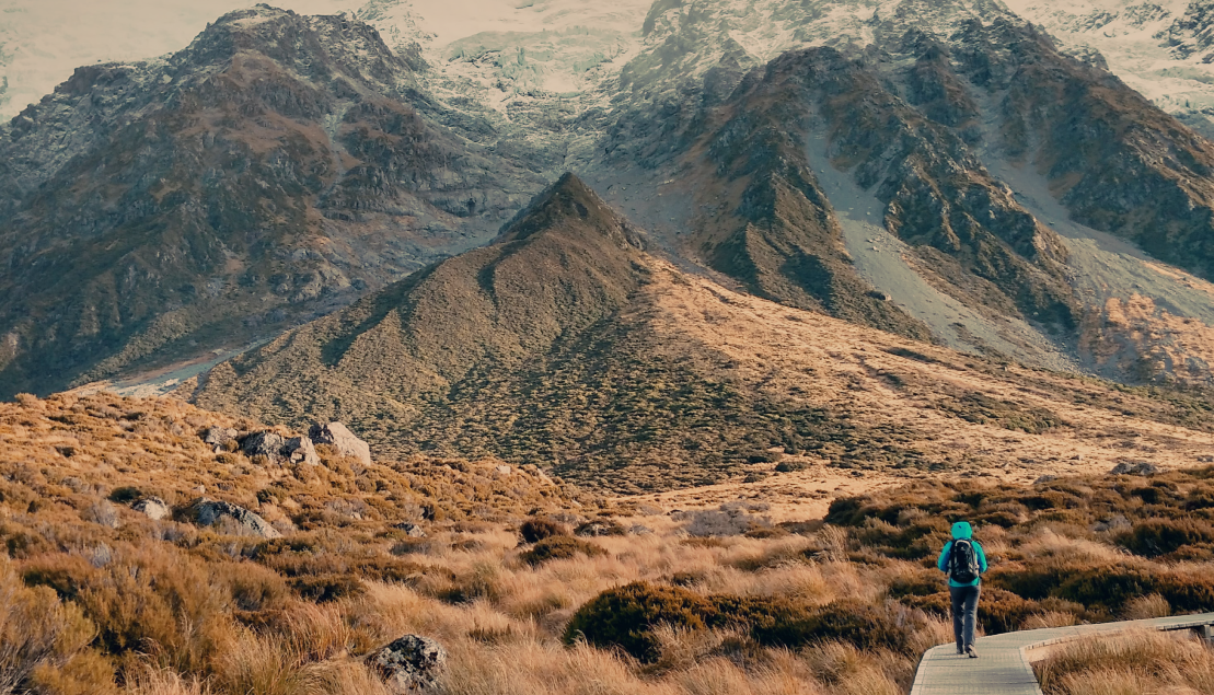
Supporting readiness through media-rich first-person perspective
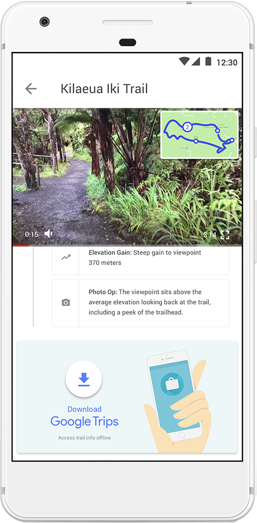
Trail videos show terrain condition and provide a glimpse of park surroundings to inform people of what they could experience and how they can prepare. These videos change where trail conditions change along the path.
Bridging the experience from home to travel
A friendly link to download Google Trips appears near the end of the trail exploration for those committed to a destination and want to access the above trail information offline.
Summary
Context
This project was for an experience design course during Fall 2017 that spanned 4 weeks. I led the product strategy, research and conceptualization. Because the project did not reach a mature form at the end of 4 weeks, I decided to design and better define the UI and interactions working in Sketch and Principle having gleaned more insights.
Challenge
To create a solution for the U.S. National Park Service’s business problem: A long-term decline in visitation threatens the national parks with a 20% drop in visitation/capita since 1987. When 1 in 4 Americans are under the age of 18, most park visitors are identified as older, and when technology competes for attention, how do we increase a desire and sense of responsibility in our generation to visit and safeguard national parks?
Opportunity
U.S. National Park Service and Google Arts and Culture collaborated in the past to distribute knowledge about parks through media-rich educational content. There is an opportunity, then, for further collaboration with Google Destinations to support the act of finding and going to the parks through actionable content that the U.S. National Park Service can provide.
Process + Approach
The project was guided by a concept-first and research driven approach with an opportunity to craft a solution that holds minimum effort and maximum outcome for involved stakeholders. Design sprints were adapted and undertaken which consisted of rapid prototyping and regular testing of ideas and assumptions.
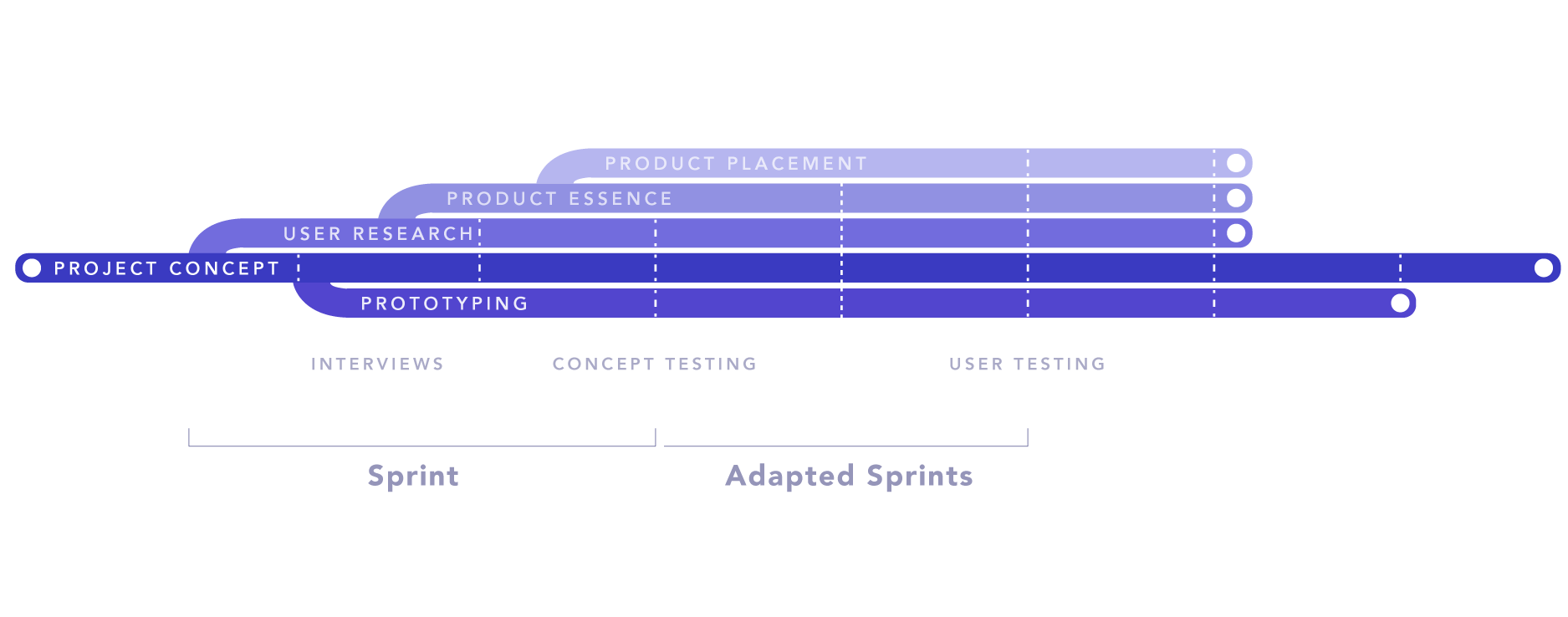
Figure 1. High level process overview showing the project concept as a guide towards the product essence through insights from user research and testing through rapid prototypes.
Breakdown
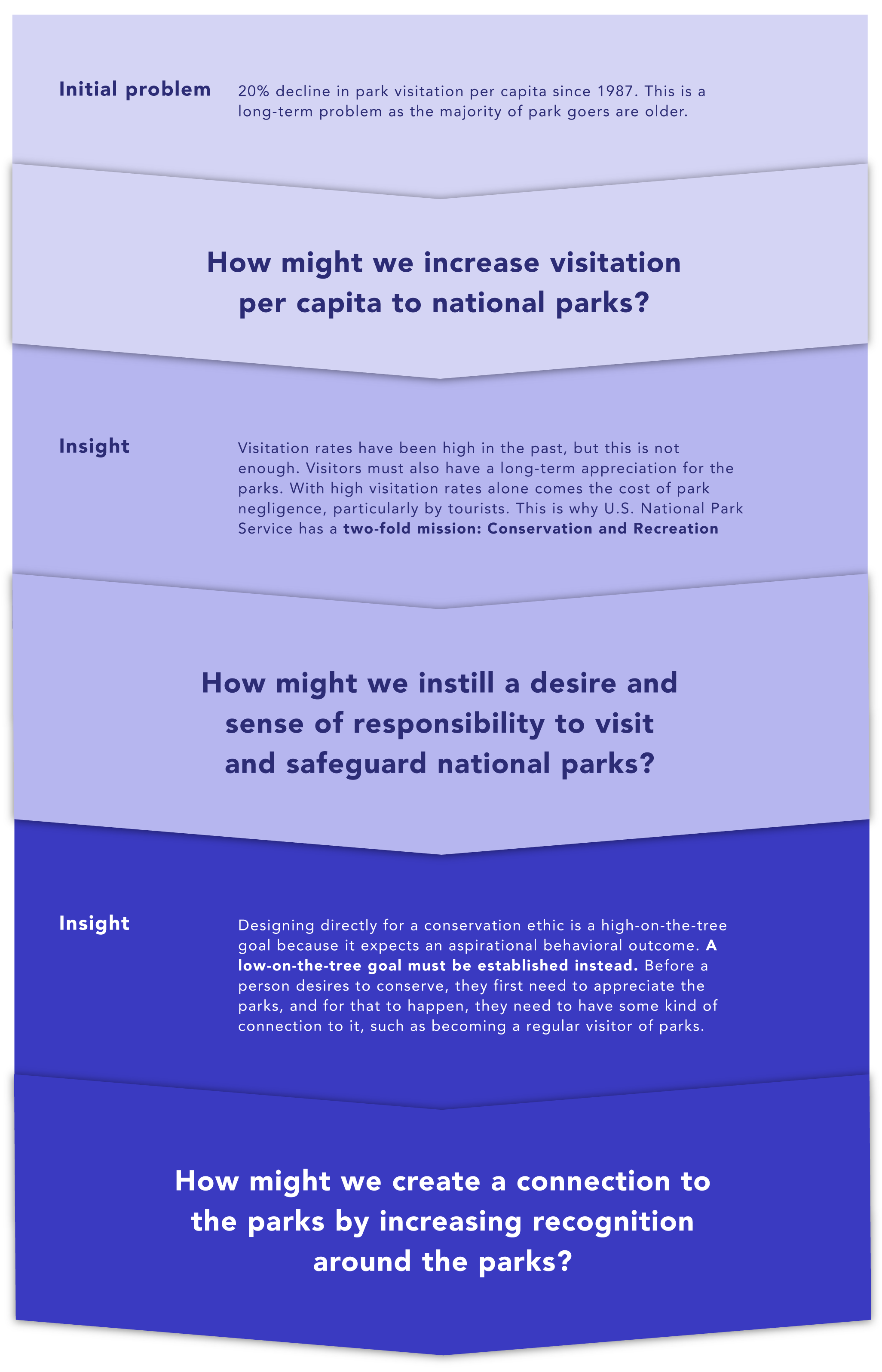
Understanding the problem
Reframing the challenge helped scope down the original problem from a high-on-the-tree goal to a low-on-the-tree goal. Looking back, making this decision brought about an elegant product solution. The following diagram shows an overview of the progression of challenge definitions through insights that influenced the project concept development.
Additional Insights
- Technology as a competitor – Though technology is seen as competing for audiences’ attention, there is an opportunity to use digital connectivity to create a connection to the parks.
- A park as a whole – Abstractly speaking, what if the park could be broken and distributed to each person?
- Each person has a personal connection to a park – How can this unique connection be resurfaced in a new way?
The above insights drove the overarching project concept: “Create a connection to the park by dispersing the park’s essence in each person and allowing it to prosper and resurface in a new way.” The idea stemmed from abstracting the park’s essence and meaning, which later took the form of surfacing trails on Destinations through web searches and connecting this information to Trips to serve individual preferences.
Research Influence on Product Strategy
I conducted research with 11 participants throughout the course of the project where 4 participated more than once. These insights guided the product essence and its value proposition. Bits of information were gathered from semi-structured interviews, online database research, concept tests and task analyses to inform the following decisions:
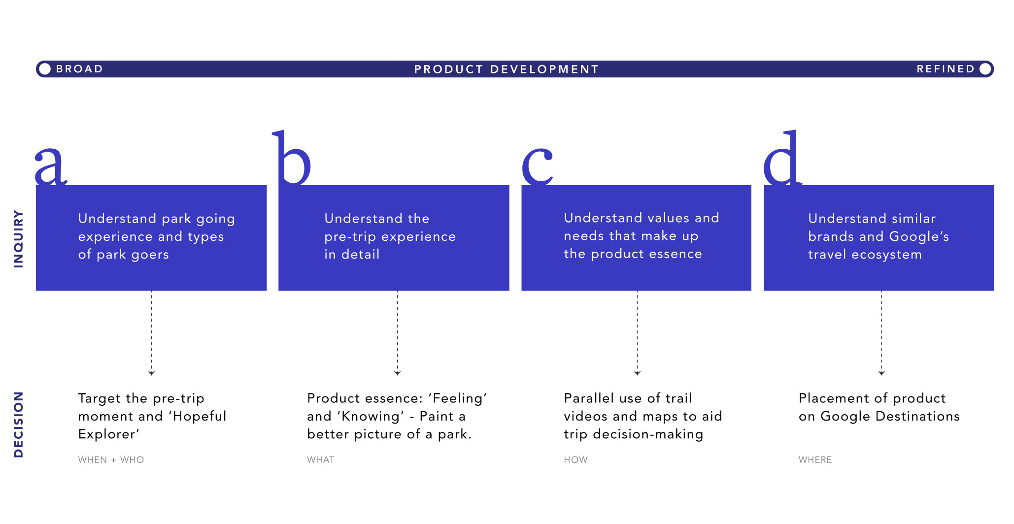
Figure 3. Overview of research influence on product development.
Key early insights: Informing Stage “a”
Most revisited their trip by looking through their phone’s photo galleries and sharing with their friends in person or on social media. This meant that a post-trip intervention was not a strong place for the main touch point. Instead, I discovered a pre-trip pattern in which a certain destination primes a person’s interest, and so there was an opportunity to capitalize and meet this early interest through a web search for a destination.
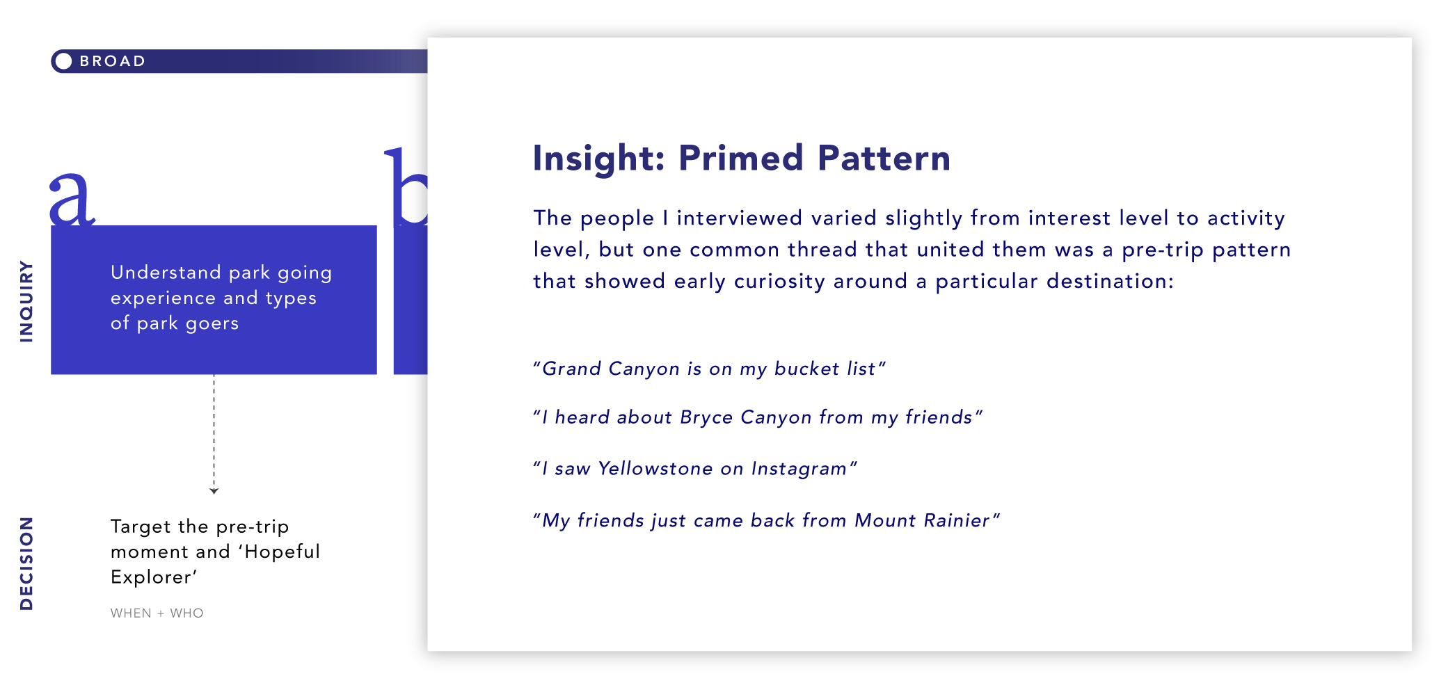
Figure 4. Insights that led to a target moment within the whole trip experience (more on this in detail later)
Identifying this pre-trip moment was important because it positioned the product to meet people where they were at as they were more likely to be searching for park information. This moment where a person searches the web to gain brief information was identified as an “I want to know” micro-moment. Building for this micro-moment was key in influencing the product concept’s position.
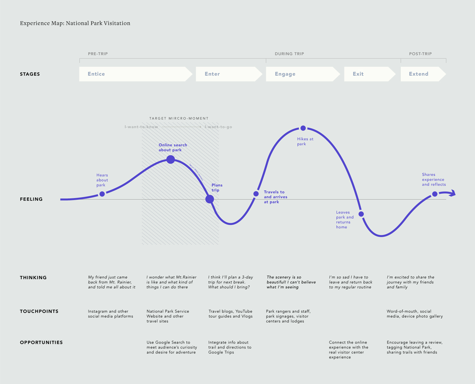
Figure 5. Journey map with a main touchpoint of meeting a person during their web search and moment of curiosity.
During this target moment, a person is in the exploratory phase where they are browsing for interested locations to potentially visit (Figure 6). A rich search result that leads straight to the proposed product is more likely to be triggered for narrower searches (See Design Decisions below), so the implications for the proposed product, then, is that it would need to support the quick flipping through of information.

Figure 6. A zoomed in part of the journey map revealing a person’s behavior during the target micro-moment with key touchpoints, frictions and perceived values.
The ideal target audience was identified to exist in the continuum between the urban dweller and hopeful explorer (Figure 7). The hopeful explorer is most likely to be more curious and looking for new destinations they heard about, and the urban dweller will more likely want to be better prepared and needing more guidance on where to look for information. The weekend warrior, on the other hand, may already have established methods of searching information about places to visit, but nevertheless, the product can still serve their broad exploratory phase.
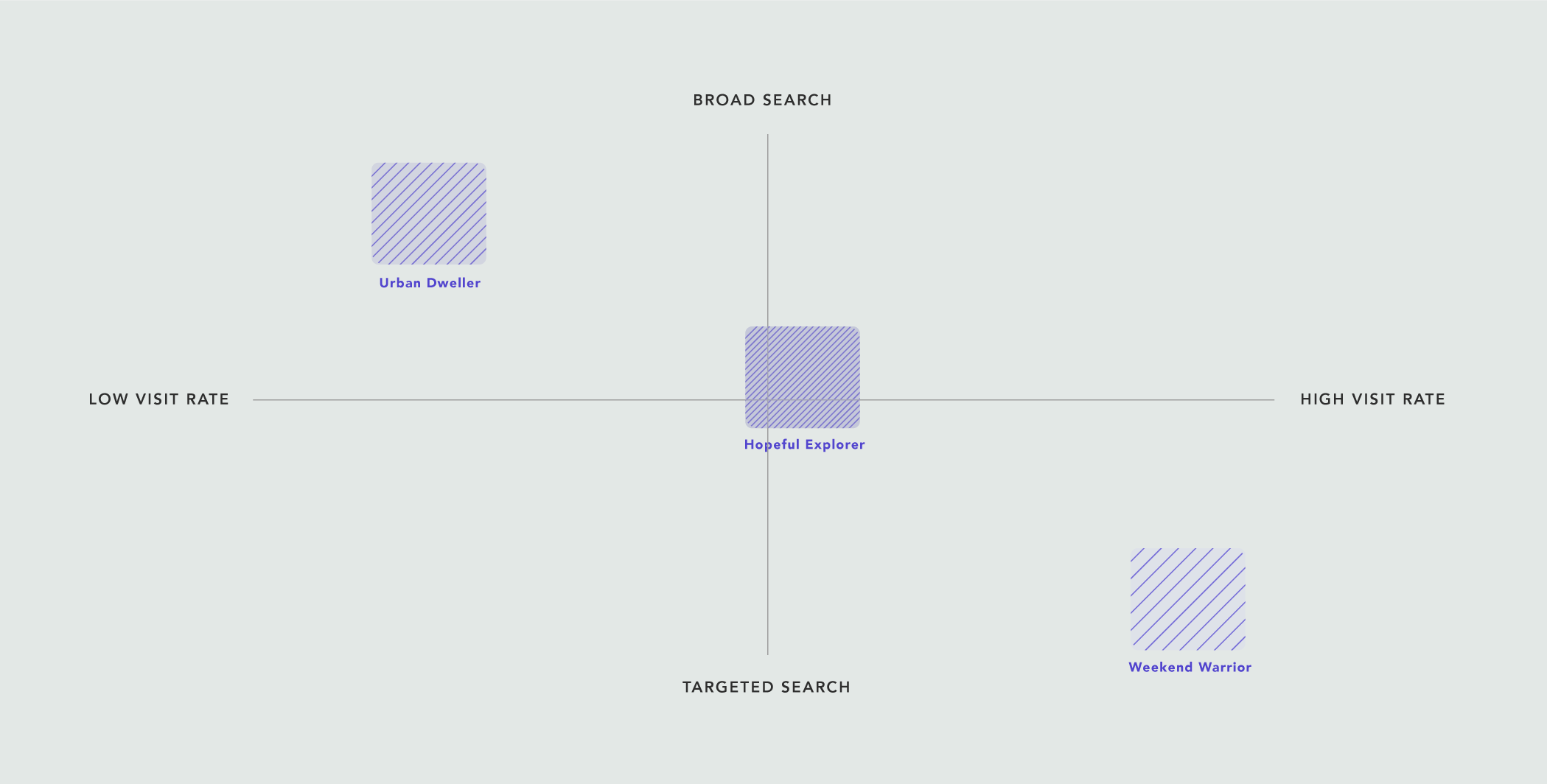
Figure 7. Three main personas with the Hopeful Explorer as the primary, the Urban Dweller as the secondary and the Weekend Warrior as the tertiary.
The behaviors of the hopeful explorer is an amalgam of several people interviewed – their behaviors and motivations are highlighted below. I found that there may be a differentiator between people within the hopeful explorer category, and this is their interest level for planning and preparation. Some participants mentioned they preferred being surprised, whereas some mentioned they wanted to see details of the physical location before going. These factors may also be dependent on the trail difficulty and the length of the trip.
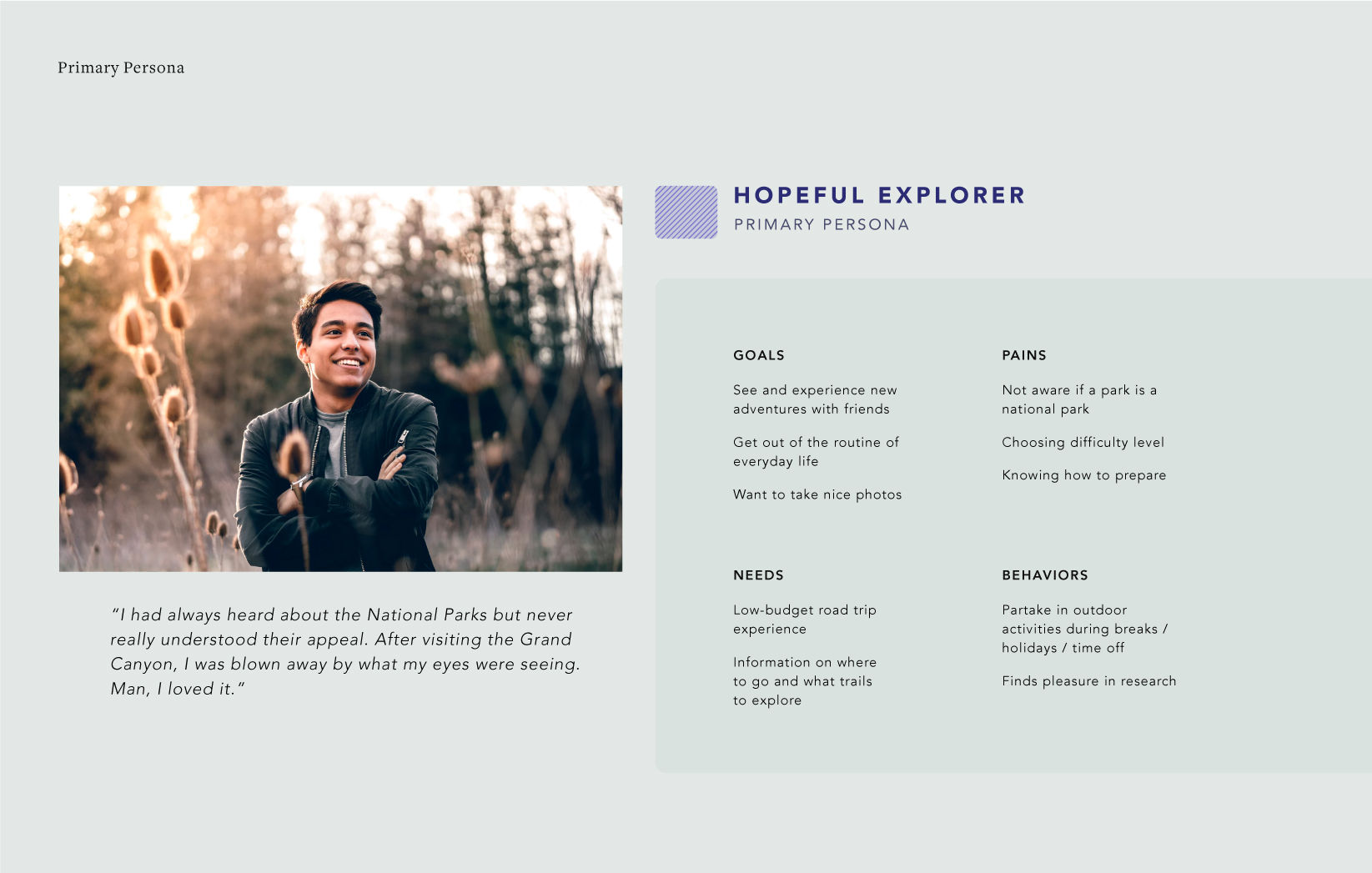
Figure 8. Primary persona: Hopeful Explorer and their motivations, goals and behaviors.
Insights that led to product essence: Informing Stage “b”
From task analyses, I saw that people were not satisfied with the information they found on National Park’s website, and jumped from Maps to one top site on search to the next in order to ‘paint’ an image of the park without getting overloaded by the details. This bit of insight helped identify the importance of bringing together relevant information to relieve the friction of scattered and overloaded content during the target micro-moment (more on this later).
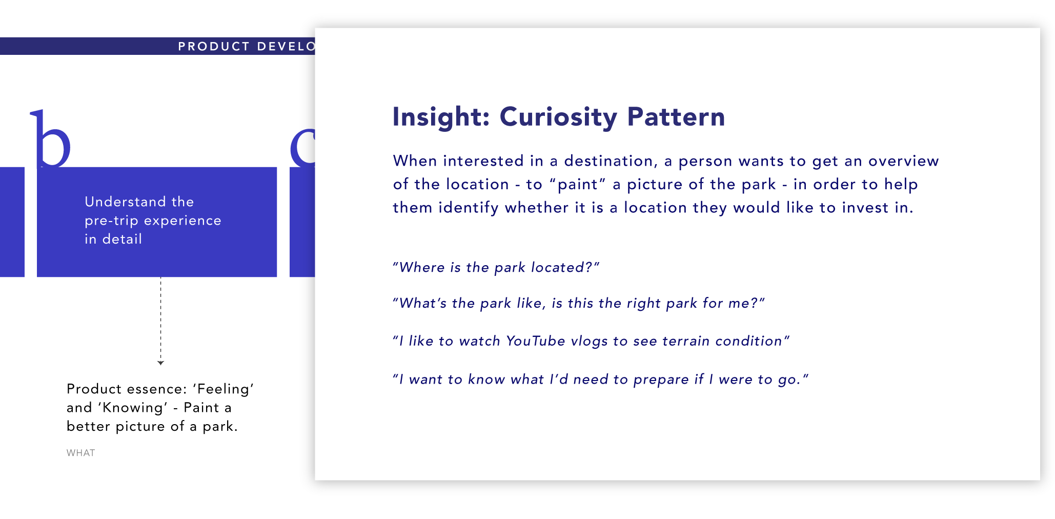
Figure 9. Pre-trip insights that led to product essence development
Insights that led to specific content: Informing Stage “c”
Most wanted to know the difficulty level of trails and some wanted to know what’s unique about a park in order to know why they would want to go. These information were marked as primary or secondary on UI priority. Most wanted to be able to quickly decide whether to learn more about the destination in order to eventually commit or to explore another destination. So to meet this expectation, I had to ensure 1. relevancy, 2. digestibility 3. actionable value of the content. This meant that information like specific trip planning and educational facts were excluded because they catered to those more committed and cater to a more passive experience.
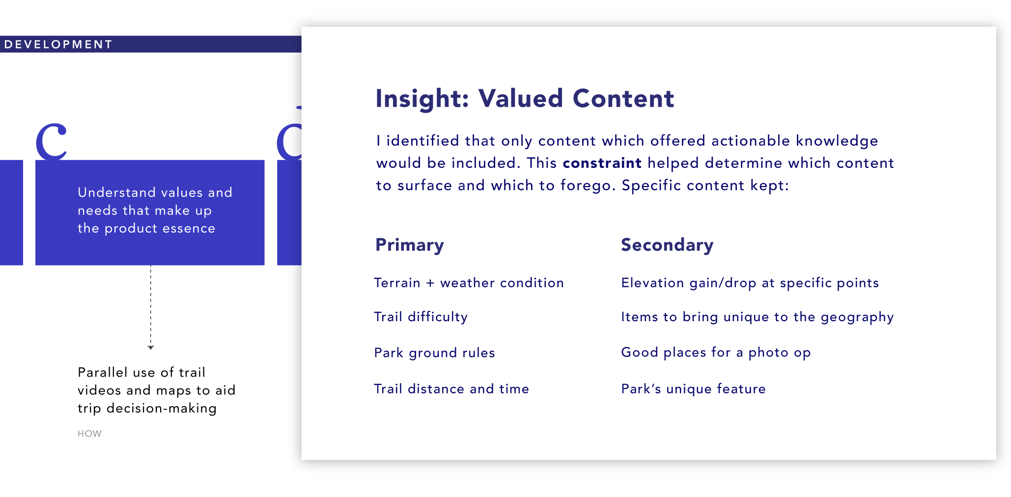
Figure 10. Insights that helped gather primary and secondary content
Insights that led to product placement: Informing Stage “d”
In order to distinguish the brand value and position from other similar products, I conducted a streamlined competitive analysis to better understand the value other services offered and the particular moments they serviced (Figure 11). Understanding the below matrix helped inform the placement of the product. The opportunity for the current product, then, was to cater those who had not yet decided on a specific destination but were more curious and considering.

Figure 11. Brand differentiation matrix within the spectrum of moment and experience offered by similar services.
From Product Essence to Value Proposition
From the research insights, I crafted the following product essence with two overarching ideas that represent mental and physical readiness: feeling (‘Experiential’) and knowing (‘Informational’). The goal was to design the intricate balance between these two ideas in order to give audiences a quick and thorough sense of a trail experience within the constraints of the web. This product essence helped guide specific contents of the product (see below).
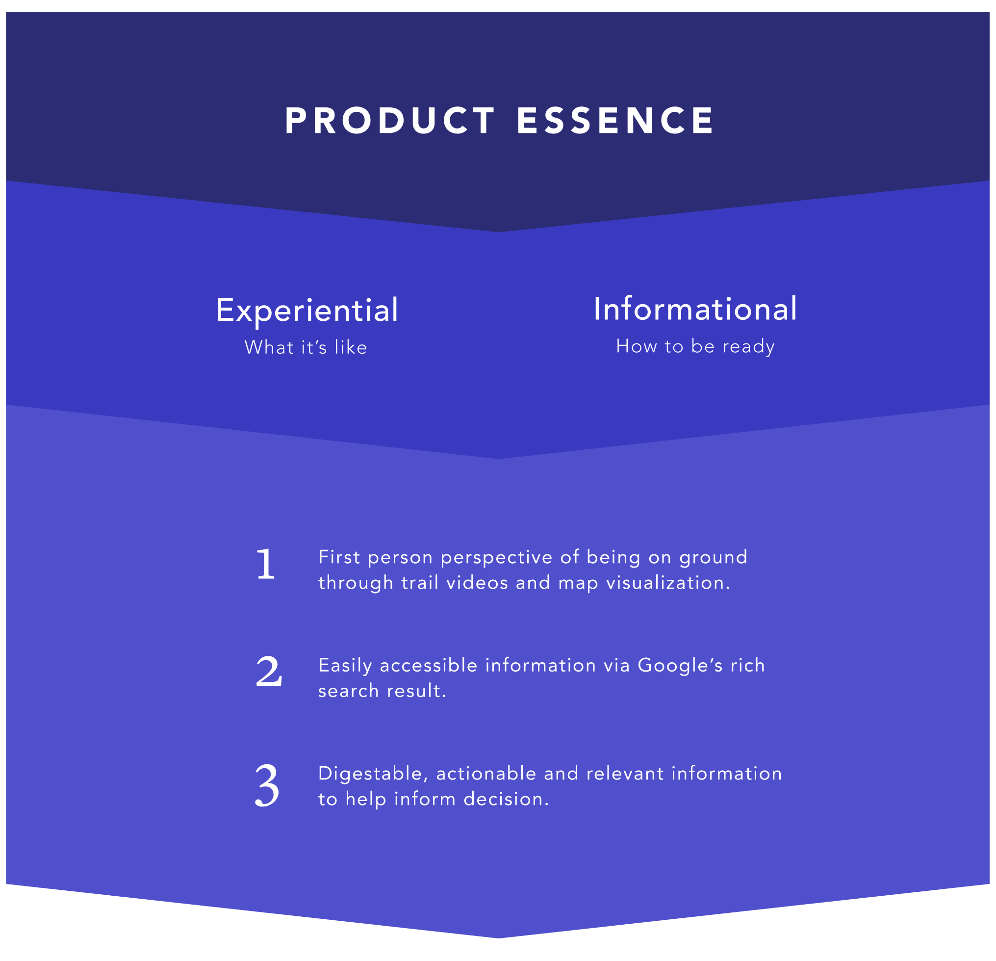
The integrative use of trail videos, map visualization and relevant trail-related content helps to inform quick trip decision making during a person’s early exploratory moment.
Design Decisions
Positioning the product within Google Destinations
Understanding Google Destinations was a challenge at first because it serves dynamic and layered content. It contains broad to more specific destinations that search indexes depending on a person’s query, so a list of countries like Japan and Hawaii may appear as a person browses through Destination’s top level. If a person searches for activities or popular places within Hawaii, for instance, Hawaii Volcanoes National Park might appear, and within that, top sights are suggested, like Kilauea Iki Trail. If their search was specific to begin with, popular places or top sights will surface in results.
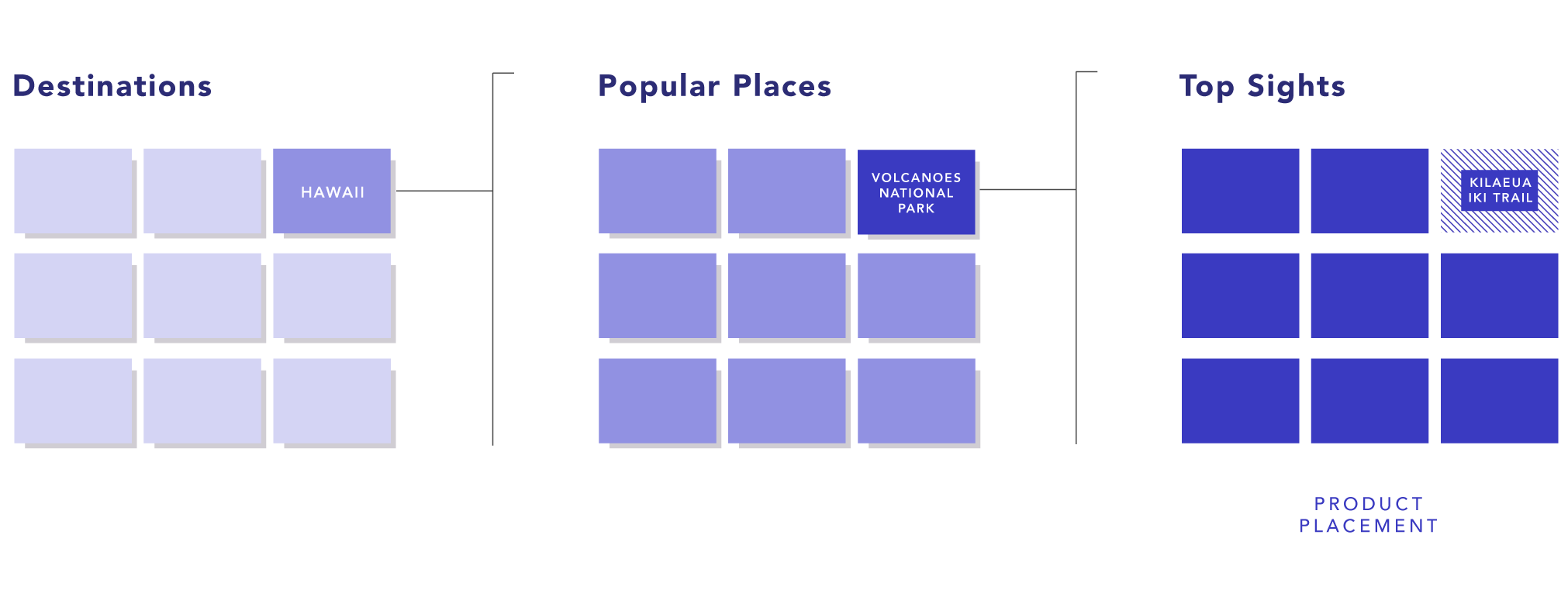
Figure 12. High level view of product placement as a ‘Top Sight’ on Google Destinations.
There was an opportunity to leverage the design for top sights since the page only offered an overview section on Maps, unlike the higher level categories which contained more information, like itineraries and videos of a landscape. The image below shows a general flow from search to a Top Sights page designed particularly for trail locations. Other ways of getting to the top sights page is through an overview card as on Maps or a Travel Guide within Destinations.
UI and Interaction
For the current project’s time constraint, I decided to focus the design for the mobile web since targeting micro-moments meant servicing more than half of smartphone usages. I realized how heavily the interface of the design relied on content, so only the information that supported active preparation within the micro-moment were included.

Figure 13. User flow showing a person’s search for a location through Destinations and into trails.
Reflection
Designing a component within an existing product was a challenge because I had to navigate within the platform’s design norms but also consider where pushing the design made sense. The project helped me understand more about the meaning between designing a delightful vs a utilitarian product, and this was especially challenging when I considered the constraint of time: the target micro-moment. Nevertheless, I wonder whether designing for a micro-moment must be a constraint on a design’s ability to offer a delightful experience.
For this project, I decided to focus on mobile first because micro-moments serve more than over 50% of mobile usage. Moving forward, I would like to design the desktop version. It would also be interesting to explore how content would appear when surfaced in Google Trips, and to better think through the transition from Destinations to Trips.
Made in collaboration with Brandon Lal, Kristy Leung, Vickie Yim and Mark Strathern.